Green elements in the interior. Light green color in the home interior - the best of nature's palette
Green color without exaggeration can be called the most natural and accessible to human perception. It is not for nothing that in all religions it is considered a symbol of life. The standard is traditionally the natural greenery of plants. It is able to refresh any, even the most austere interior, bringing with it inspiration and peace at the same time.
Variety of shades
However, the green color is not as simple as it might seem. It has many shades, each of which has its own characteristics and has a certain effect on the human psyche.
So, dark green and emerald - stimulate thought processes, improve attention and memory. This perfect option for work, living room or library. The noble and restrained olive will also find its place here, filling the room with majestic tranquility.
Juicy light green and liqueur Chartreuse, have a positive effect on the child's psyche, relieve eye strain. Bright and dynamic, these colors fill rooms with cheerfulness and optimism.  Tenderness and harmony to any room from the bedroom to the living room will add a pacifying pistachio, completely neutralizing emotional overload.
Turquoise and aquamarine represent cool freshness and endless sea expanses. Balancing between the blue and green spectrum, they add a special charm and sophistication to any interior.
It is thanks to such a rich variety of color nuances that green shades are so in demand among designers around the world.
Green color in interior design
Often, for the design of premises, people choose green on a subconscious level. But in order to achieve true harmony and get a unique effect, the selection of interacting shades should be taken very seriously. Sometimes for this it is even worth asking for professional help, a designer.  When choosing green tones for, it is important to consider the following parameters:
- Room assignment. Delicate greens are suitable for or kitchen, cool, invigorating shades - for youth interior and, and noble dark tones will take their rightful place in the library or office;
- Room size. The lighter the shade, the more spacious the room looks, and vice versa, for large space as a basis, a dark green color spectrum would be more appropriate;
- Illumination degree. To make the room more free and airy, you should use delicate shades of green. The more natural light in the room, the deeper and richer the selected colors can be;
- Stylistic orientation. Each interior style has its own palette. So, muted grayish-green shades are suitable for, for - juicy natural greens, and in, as a rule, preference is given to more strict, dark shades.
Combinations with other colors
Green, like other colors, has its own companion colors, the combination with which allows you to get especially winning combinations:
White. When combined with green shades, it helps to create a fresh, cheerful interior. Such a composition gives the room an airy lightness, visually increasing small rooms and filling the spacious halls with boundless freedom.  When using bright saturated shades greenery, it is worth balancing them with a significant amount of white elements.
Brown. The symbiosis of greenery with brown hues embodies nature itself. Such an interior calms, creating a feeling of comfort and serenity. When organizing such compositions, it is recommended to combine dark green tones with light ones, and vice versa. Most in demand in such combinations: pistachio, coniferous, olive and green apples.  Blue and cyan. Celestial shades harmoniously echo the natural greenery of the foliage, allowing you to create spectacular, cheerful interiors. Moreover, the dynamics in this case is set precisely by the degree of saturation of both colors.
  Red. The significant contrast of the red-green composition makes it necessary to exercise extreme caution when using it. However, such a union is provided by nature, as exemplified by berries against a background of greenery or bright flowers on a lawn, so you should not refuse it. Muted with white and gray shades, such a juicy tandem will be appropriate both in the kitchen and in the living room, giving them a special appeal.
  Grey. The combination of gray and green shades in one interior fills the room with sublime sophistication and elegance. This design always looks impeccable and concise. This perfect solution for bedroom, kitchen and living room.
  Pink. Delicate and juicy shades of this color against the background of muted greenery create mouth-watering fruit and berry bouquets. Such combinations will be appropriate in the living room, nursery and dining room, fill the premises with optimism and positive.
  Yellow. Its bright shades can cause irritation, but muted ones, in combination with similar variations of green, on the contrary, have a mildly calming effect. Such combinations are suitable for the bedroom, nursery and living room.
  Sunspots of yellow against a background of saturated green are best used in fragments, exclusively for accents.
Black. In combination with bright greenery, it allows you to create an unusual, extravagant interior. But such a palette must be diluted with steel or snow-white accents.  Green. As an independent color, it has many shades that are perfectly combined with each other, allowing you to create unique combinations.
We receive a large number of questions related to the harmonious combination of colors in the interior (). Due to the increased interest, we will take a closer look at this topic and we will start with the interiors. Let us dwell in more detail on harmonious color palettes ah, which will be based on shades of green.
How to work with tables
Main color(vertical bar) it is on it that we rely when compiling the corresponding color palette. This color is usually a color.
First row: matching shades of the same color(you can use one or all at once in not large quantities).
Second row: matching shades of other colors(you should not use everything at once, stop at one or two shades).
Third row: contrasting shades(can be used as accents to spice up the interior).
Basic colors black, white, beige, gray will fit perfectly into any interior. Keep in mind that black in large quantities is contraindicated for interiors in delicate and pastel colors.


Green color as it is, it is rarely used in interiors for its radical brilliance.

Details and examples of color palettes in the photo
1. Light mint shade of green, almost gray. Discreet and refined, incredibly popular in the 60s, it is back in fashion both in interiors and on the catwalks. Looks good paired with white, silver, pink and light brown. Ideal for creating a retro style interior. The photo shows a typical example of such an interior. For brightness, add yellow-green and contrasting wine shades to the interior in a small amount. Try to avoid black.


In the mint style in the photo: yogurt, mint ice cream, Sally Hansen varnish, dress from Zara spring-summer 2012, "mint" kitchen from traditional home.
2. Withered green fading to yellow. Optimistic yet complex. On a sunny day it will appear yellow, on a cloudy day it will appear green. Pairs perfectly with white yellow hues(mimosa, yellow apple, pear). Violet shades can be used for contrast.


Green and yellow accent photo: pots from the Pottery Barn collection, arounna bag from etsy.com, bathroom, folder organization from Martha Stewart, pillow from the fermlivingshop.us collection.
3.Light green grayish shade is an almost universal background for any interior, and especially for an interior in a retro or scandinavian interior. Ideal in combination with white, gray, beige and light brown. Looks great with blue-green, dirty turquoise and herbal shades. Add contrast with things in burgundy, dark red shades.


In the photo: bed linen from the Cortona Duvet & Shams collection, bed linen from the westelm.com collection, fishseddy.com china, a towel from the williams-sonoma.com collection, wallpaper from the grahambrown.com collection.
4. Green-turquoise shade - quite popular lately, both light and dark. Almost all shades of blue and green are suitable for him. Can be used in high-tech interiors or interiors in the style of the 60s. Equally loyal to both steel and bronze. Suitable for bedrooms, living rooms and bathrooms.


In the photo: Homes & Gardens interior, wallpaper from the walnutwallpaper.com collection, soap self made DirtyDeedsSoaps, KindredSpiritHome handmade pillow, Antonia and Fabio earrings all on etsy.com.
5. A dirty olive shade is best used locally for a noble "aging" of the interior. This shade blends perfectly into ocher and green. Suitable for interiors of hunting lodges, as well as for interiors in country style, Provence. Against such a background, old wood, leather, straw accessories, metal accessories covered with patina or oxidized look great.


Olive accents: williams-sonoma.com, walnutwallpaper.com collection wallpaper, Prunella handmade soap, williams-sonoma.com olive press, williams-sonoma.com pillow, mineral olive eyeshadow.
6. green tint with care in jade. The photo looks incredibly noble due to the high walls, uneven color and lack of white. As a contrast, you can use saturated pink color. A versatile shade that will invigorate you like you've been in the jungle. We do not recommend choosing it as the main color for the bedroom, but in the living room, bathroom or nursery, it will confidently fulfill its life-giving mission.

7. This thick contains enough black pigment to be considered universal, and at the same time, retains all the vivacity of the green color. Be sure to dilute it with white and blue shades. Blue, blue, turquoise, yellow are suitable for it. Black only in accessories.

8. The so-called verdun green. In cloudy weather, it “leaves” in dark green, on a sunny day - in yellow. An interesting, rich and complex shade that is loyal to white, black, gray, yellow (fading to orange) and blue. Please note that in this interior a dirty red shade is used as a contrast ( component paintings) - this creates an interesting conflict on the wall, from which it is difficult to take your eyes off. Often, it is for this purpose that contrasting colors are introduced, to add a little "drama", to "shake up" the interior.

9. Dark olive shade - noble and quite versatile. Dilute with white, brown and black. Add herbal and ocher. For contrast, use pink shades.
It's no secret that colors affect human consciousness. Some shades are associated with danger, while others bring a sense of peace. And although in modern world we don't need to analyze environment for the sake of survival, in personal space, you still want to feel as comfortable as possible. Green color in the interior is a great option for such purposes.
Influence on the psyche and features
Experts from the reputable Pantone Color Institute have named greenery or “fresh greens” as the main shade of 2017 — a rich green-yellow that symbolizes new beginnings, as well as the desire of a person in the technogenic world to be closer to nature. This is just one of the reasons why it is worth including green in the interior palette, but far from the main one. Along with the aesthetics and a badge of honor for following the latest trends, you will get a lot of benefits by opting for such a natural shade.
Green is the color of will, freshness and happiness. Sounds too romantic, but it's true. Psychologists advise using this shade if you are a purposeful person who needs additional source energy. The fact is that it contributes to the rise of mental activity, and also increases concentration. People who are sensitive to colors show a 10% improvement in positive results in solving problems, while the number of errors decreases by 20%.
In addition, green has a calming effect, harmonizes the work of the motor apparatus, normalizes blood pressure and can even have a healing effect on vision.
Of course, this is not a panacea. Do not expect that the use of green in the room will dramatically change lives and improve health. But there is a small positive effect. Is it worth mentioning that people who like this color will have a constant source of good mood?
Even I. W. Goethe noted that for rooms in which you are constantly staying, it is better to choose green. But not all modern scientists can agree with him, at least if we are talking about the bedroom. It is believed that an excess of shade will interfere with relaxation, provoking the work of the brain. Here it is worth relying on your own feelings and needs. For example, for some people, the bedroom is also an office. However, to neutralize the impact on the psyche, it is enough just to turn off the light.
For the rest of the rooms, there is no doubt - green will be a great option in the kitchen or in the hallway. It is only necessary to decide on a shade: like other colors, it has many varieties, each of which causes certain sensations. Light green and light green are positively perceived by a person, but darker or marsh species can cause anxiety, sometimes blues, instead of getting rid of them.
The effect also depends on the lighting in the room. A simple principle applies here: brighter shade, the more subdued light, and vice versa - coniferous, marsh options can be made warmer with the help of lamps. Don't be afraid to experiment by choosing a solution that suits your particular space.


What colors to match?
So, after weighing all the pros and cons, you decided to decorate the interior of the room in green. Great, now you need to decide what shade to combine it with. After all, the whole space cannot be one-color, just one of them dominates. Consider the most popular "couples".
Green with black
You can’t spoil the poetic black, it is the ideal basis for any option. Although at first glance it may seem that these colors contradict each other. Green, as a symbol of life, sometimes competes with a dark "partner", but only if the design is approached incorrectly.
Black goes well with coniferous, deeper tones, although such an interior may seem gloomy to some. To combine it with light green, it is recommended to enter white elements - this harmonizes the composition.


Green with white
Neutral white goes well with a light palette, neutralizing excessive brightness or saturation.
The ideal option is white walls and green furniture, which such a background will only emphasize. This combination is suitable for the bedroom, as the first color has a calming effect, slightly holding back the tonic effect of the second.


Green with yellow
Perhaps the most cheerful combination, which mentally takes the visitors of the room to a lush meadow, generously lit by the sun. In such an interior it will be warm even in winter, but in summer it can become a little uncomfortable. Make sure that the windows do not face south, otherwise there will be an overabundance of light.
In this range, both separate compositional elements and one object can be made - they are perfectly combined, smoothly transitioning into each other. Of course, we are talking about light green or lime shade. Dark green does not look good with yellow.


Green with brown
Like previous version, this combination came to us from nature itself, therefore it seems the most harmonious for perception. Brown refers to the color itself, as well as the use of wood, which is even better.
The interiors look cozy and calm with cream walls, light wood floors, wooden furniture with beautiful texture, as well as with light green details in the form of decor, textiles or other design items.


Green with blue
Although green does not go well with the same bright accents, but with blue it can find mutual language. In this case, we are talking about both dark and light combinations, but it is better if some other, more neutral shade balances their "union".
For example, light green and blue objects look great on a white background. Try not to use very saturated varieties, especially in the bedroom.


Interiors in green tones
No matter how strange it may sound, but the green color in different rooms will look different, mainly due to their purpose, materials used or sizes. Let's dwell on each in more detail.
Green color in the interior of the living room
The living room is a place of rest, work, communication and entertainment. Here, a person, with a standard layout of an apartment, spends most of his life doing important (and not so) daily activities. Therefore, tonic, but at the same time soothing green in all its variations will fit perfectly into such a room.
It can be individual items or the front wall, on which the TV screen is located, mint, light green or swamp shades - this will not interfere with your peace.
It should only be borne in mind that in a small living room it is better to give preference to light shades, combining them with white.


Green color in the interior of the kitchen
Some experts argue that the green color improves appetite, and therefore its use in the interior of the kitchen will be very appropriate.
For a Provence-style room, you can choose a mint shade by coloring it carved furniture. A modern kitchen will look harmonious if you purchase bright green furniture for it with a glossy surface, balancing it with more restrained walls. However, a wooden set against a coniferous background will look just as good.


Green color in the interior of the bedroom
Try to avoid saturated shades - they, as already mentioned, can prevent complete relaxation. When introducing green into the interior of the bedroom, it is better to build on the natural palette, creating a natural, light atmosphere.
If you want to use green for finishing, choose pastels or cooler varieties like mint and turquoise. You can also "paint" only one wall, balancing it with white partitions.
Green wallpaper with a pattern looks good, especially in classical style. It is recommended to buy at the same time wooden furniture This design will take you closer to nature.


Green color in the interior of the bathroom
Usage tiles as finishing material offers many options for decorating space in green. If the area of \u200b\u200bthe room allows, then you can choose a mosaic from different shades. In a small bathroom, this solution will look too colorful. But, in any case, white plumbing will balance your experiments.
However, in our reality, bathrooms are rarely spacious, so when using green, it is better to limit yourself to a few items, such as cabinets.
A natural theme looks appropriate in the bathroom, which can be continued with the help of plants.


Green is one of the most lucky flowers for the interior. It has a calming, pacifying effect, relaxes, symbolizes harmony and tranquility. There are many shades of green. From cold (for example, close to yellow), to warm (turquoise, emerald).


Light shades of green give the room an atmosphere of coolness and freshness. Dark ones create associations with high cost and reliability. Apple, mint and sea wave improve mood, have a positive effect on the body. In addition, the green color is combined with almost any other, so it can be used in the interior of any apartment or room. But not everyone will like a house completely decorated in green tones. It is recommended to use it either only in furniture or only in decoration.


Three rules for using green:


2) Green should not "hit" the eyes. this is easy to achieve: the more greenery is planned in the interior, the softer the shade is chosen. It is worth remembering that an excess of bright colors is tiring and annoying.


3) So that the room does not resemble a cramped green box, you should not choose a solid green wall decoration for small rooms. So the room will be visually narrowed. Exists traditional methods dilution of colors, with their proper use, the green room will not be visually reduced.


Original color combinations and combinations.
1) The combination of wallpaper. Design solutions to create comfort.
Large areas can be diluted with three or four colors. Two of them are the main ones, preferably contrasting, the rest connect the design of the room with a common composition. Do not overload a small room with a variety of colors. Two shades close in color will suffice.

Warm shades of green go well with reds, browns, oranges and yellows.
- the colors of the cold palette of green - with lilac, purple, lilac, pink, blue and blue.
– gray, beige, white and wood surfaces look great with all shades of green.


Combining colors of the same color scheme is a win-win design option. This is a non-standard, bright way suitable for almost any room.
Original design tricks:
1) Accent walls.
This interesting way consists in highlighting a wall or some part of it with one color. This technique visually changes the geometry of the room. Here are examples for a green tint:


2) Relief images.
A dark green pattern on a light background (or light on a dark one, depending on the size of the room) creates a relief effect on a smooth, shiny surface and helps to give the room a fresh feeling. It is very important that the room and its space is not overloaded with plain green.


Greenery in furnishing
Green furniture complements the overall atmosphere, can also serve as bright accent that sets the tone for the whole design. The latter is especially true for modern styles like a loft, high-tech, minimalism. As a special technique of "accent spot". In other cases, one color of furniture should be repeated.
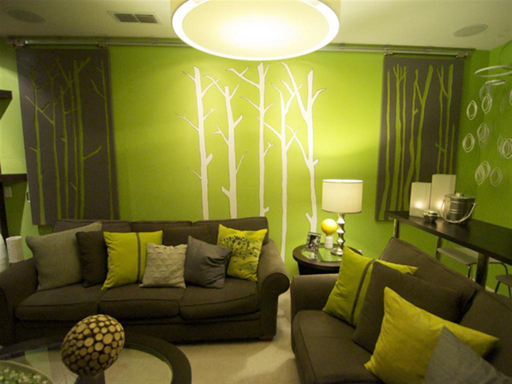
 The green sofa in the living room is the most popular furniture option of this color.

 Shiny green table - a bright interior detail
 In interior decoration, greenery and lawns are almost a win-win option. Accessories of bright green color will complement any interior. For decoration, green carpets, curtains, candles, figurines, paintings with hand-drawn greenery, lampshades are perfect.
 Fluffy green round carpet - lawn in your home
 Of course, a holistic, thoughtful design will look more impressive. To do this, it is enough to choose one shade from the green palette and repeat it several times in furnishing, decoration and decoration.
Liked the article? Share on social networks!
Green shades in the interior of the living room are not so common, but the color of nature itself soothes, pacifies and pleases the eye. The interior in green will never look corny, it is always fresh and new. In this article, we will look at how to decorate a living room in green tones and make your guest room attract and call to you.
Influence of the interior with green shades on people
The color of nature itself will have a truly magical effect:
- Calms and relieves emotional stress. Such qualities are shades of green with the addition of blue and cyan. They bring serenity to the atmosphere;
- Light green, malachite, olive - all these colors can affect appetite. For those people who are struggling with excess weight and are used to eating in front of the TV screen, green interior details will help reduce appetite, reduce the need for food;
- This shade of the interior is able to improve the microclimate in the family. Any of its tones will help smooth out conflicts, relieve tension, positively affect the well-being of each of the household members;
- For people who work at a computer for a long time, a green element in the interior will help relax the visual receptors, calm them down;
- A living room in blue-green shades will create an even emotional background. Therefore, it is suitable for people who are unbalanced, with frequent mood swings;
- The green overall tone of the room with red accents will suit those of us who fear the future and have lost faith in ourselves. These shades motivate to overcome obstacles, set up to get results;
- Any combination of it with yellow will help smooth out sharp corners character, awaken the desire to please others.
Shades of green
The design of the living room in green tones looks very impressive, and at the same time brings comfort and revitalization. There are so many shades of this color that anyone can choose the most suitable one.

It is because of the breadth of the tonality of green that difficulties arise in working with it. There are problems in choosing a shade and matching colors. But all these obstacles are easily blocked by the positive influence of this color and its magnificent appearance.
- Pistachio, mint, apple tones will help to relax and set you up for rest, but at the same time they will give freshness and novelty. Their tenderness and light will help create a calm and peaceful atmosphere in the living room. cozy atmosphere, feeling of peace;


- Olive tones will give the interior elegance and warmth. These shades are good for small spaces, they are able to increase the space, move the walls;


- Owners of large living rooms who prefer a classic orientation in the interior often use tones such as emerald green, dark turquoise, coniferous. They will help give your living room in dark green tones of luxury and grandeur. The saturation and depth of these colors contribute to a certain severity;


- The peculiarity of this color is that in the hot midday sun it brings a feeling of coolness, and in the winter cold it warms, reminiscent of summer days. That is, green tones can be both cold and warm! Experienced designers know about this amazing property of color, actively using it in the design of sunny or shaded apartments.
Advice! It must be remembered that an overdose of green in a room can spoil the impression. When working with this color, it is important to think through everything to the smallest detail, to correctly find the accompanying shade, and then, by interacting, these colors can produce a deafening effect.
In the following photos of various living rooms in green tones, you can see how the muted shades of nature push back the walls and fill modern dwelling living force.


White and green living room: a combination of color and style
Features of the combination of shades
The current combination of these colors will create the impression of a spring wind in your room. When choosing them, you need to remember that neutral White color will find harmony with the delicate and diluted colors of green. Saturated greens and radical white will create too bright contrast and will not be able to give the room light and air.
If you choose white walls, marsh, pistachio and mint shades of furniture and curtains will give a feeling of comfort and peace. In the photo, the combination of soft green and white in the interior convinces of this.


Accessories
Useless in such color scheme there will be accessories. A few bright accent spots will add dynamics and energy to your interior. It can be bright pictures on the wall, unusual shape vases, sofa cushions.

Style options
When creating a white-green living room, the value chosen is style decision. With sympathy for timeless classic choose white walls and green upholstered furniture. A gold or silver pattern on its upholstery will look great. Heavy matching curtains on tall windows complete the picture.

The white-green style of the interior of our time will look very different. Modernity will require painting the walls in apple color, white upholstered furniture, bright stickers on the walls, fluffy carpets to match. Organically bold combinations of shades of green, various surface textures will look here, their contrast will emphasize the chosen stylistic direction.
Attention! To get an extraordinary interior solution, you need to understand which color will be dominant in your living room, white or green.

Shades of wood and green
Green color will never show itself more harmoniously than in symbiosis with natural natural shades! Under no circumstances will your interior be so close to nature. This combination is self-sufficient, it does not require the addition of a third color, as it is ideal in itself.
This combination is very close to eco. This new style who prefers natural tones in interior decoration. It is able to harmoniously open up in a combination of woody and herbal shades. For example, cabinet furniture and a pistachio sofa with matching pillows will be a win-win option.
Attention! Light woody tones will give a smoothness to the room, while deep and bright tones will appeal to lovers of clear boundaries and a rich interior.


Being in this room, you can relax after the stress of a hard day, feel safe.
Green with pastel shades in the living room
In combination with pastel shades, muted soft greens will look very gentle and cute. Dairy, marble and beige colors green will be favorably shaded, which is better to choose with a discreet pattern. This will add warmth and comfort to the interior.
The harmony of these colors will help create country style, such as provence or country. The tenderness of pastel shades combined with apple or olive will take you to the original province of France. And interior elements in chocolate green shades in a cowboy style will create a feeling of the wild west in the living room.

Green and black in the interior
The use of black in the interior helps to add rigor and pedantry. This color should be used very metered as an accent. The choice of this color obliges the appearance of a third main shade in the interior. In this case, it is most advantageous to use white and its derivatives. On the Photo you can see how harmonious the design of a living room with black furniture can be.


The accent of black in the living room in green tones is the best way to emphasize such modern stylistic trends as hi-tech, loft and minimalism. These colors will help emphasize the relevance and novelty of these styles, feel the rhythm of our era.

Blue combined with green was once considered a manifestation of bad taste, and today these tones can often be seen side by side. Their harmonious consonance depends on the saturation of each. The paler the blue hue, the more intense the grassy should look, and, conversely, with a bright and juicy blue, delicate greens coexist peacefully.
The style direction of the design of the living room in green and blue colors may be different: an unexpected combination of these shades will help create and classic interior and the most modern.


If you want to create an original and memorable living room, it is impossible to find a stronger and truer shade than olive, pistachio, marsh. Properly using them, you can get the living room of your dreams!