Optical and mechanical color mixing. Color mixing Optical color mixing
Optical color mixing

3*


86. J. SULFUR. Circus


A. Imprint with purple ink
b. Yellow paint imprint
V. Blue paint imprint

d. Printed in black paint
d. Four-color print

Mechanical color mixing


Notes:
§6 Mixing colors
Naturally visible colors are usually the result of mixing spectral colors.
There are three main methods of color mixing: optical, spatial and mechanical.
Optical color mixing
Optical color mixing is based on the wave nature of light. It can be obtained by very quickly rotating a circle, the sectors of which are colored in the required colors.
Remember how you spun a top as a child and watched in amazement at the magical transformations of color. It is easy to make a special top for experiments on optical color mixing and conduct a series of experiments (see exercise 11). You can make sure that the prism decomposes a white beam of light into its component parts - the colors of the spectrum, and the top mixes these colors back into white.
In the science of “Color science” (coloristics), color is considered as physical phenomenon. Optical and spatial color mixing are different from mechanical color mixing.
The primary colors in optical mixing are red, green and blue.
The primary colors in mechanical color mixing are red, blue and yellow.
Additional colors (two chromatic colors) when optically mixed they give an achromatic color (gray).
Remember how you were at the theater or circus and enjoyed the festive mood created by colored lighting. If you carefully follow the three beams of the spotlights: red, blue and green, you will notice that as a result of the optical mixing of these beams, the color white will be obtained (Fig. 84).
84. Optical color mixing
You can also conduct an experiment to obtain a multicolor image by optically mixing colors: take three projectors, put color filters on them (red, blue, green) and, at the same time crossing these rays, get almost all the colors on a white screen, approximately the same as at the circus.
Areas of the screen illuminated by both blue and green colors will appear blue. When blue and red radiation are added, a purple color is obtained on the screen, and when green and red are added, a completely unexpected result is formed. yellow.
3* Optics (from the Greek optike - the science of visual perception), a branch of physics that studies the processes of light emission, its propagation in various media and the interaction of light with matter.
85. Mechanical color mixing
Compare: if we mix paints, we get completely different colors (ill. 85).
Adding all three colored rays, we get white. If you install black and white slides into projectors, you can try to make them color using colored rays. Without having done such an experiment, it is difficult to believe that a variety of color shades can be achieved by mixing three rays: blue, green and red.
Of course, there are more complex devices for optical color mixing, such as a television. Every day, including a color TV, you receive an image on the screen with many shades of color, and it is based on a mixture of red, green and blue radiation.
Spatial color mixing
86. J. SULFUR. Circus
Spatial mixing of colors is obtained by looking at small color spots touching each other at a certain distance. These spots will merge into one continuous spot, which will have a color obtained from mixing the colors of small areas.
The merging of colors at a distance is explained by light scattering, the structural features of the human eye, and occurs according to the rules of optical mixing.
It is important for the artist to take into account the patterns of spatial color mixing when creating any painting, since it will necessarily be viewed from some distance. It is especially important to remember to receive possible effects mixing colors in space when creating paintings that are large in size and designed to be perceived from a great distance.
This property of color was perfectly used in their work by impressionist artists, especially those who used the technique of separate strokes and painted with small colored spots, which even gave the name to a whole direction in painting - pointillism (from the French word "pointe" - point).
When viewing a painting from a certain distance, small multi-colored strokes visually merge and evoke a feeling of a single color.
87. PAUL SIGNAC. Papal Palace in Avignon
88. J. BALLA. Girl running out onto the balcony
Interesting experiment The artist Giacomo Balla decomposed color into its components. He decomposed not only color, but also movement into its component phases, using the principle of sequential recording of movement, as when taking instant photography. As a result of this, the amazing painting “The Girl Running Out onto the Balcony” (ill. 88) was born, which only when viewed from a distance based on the spatial-optical mixing of colors reveals the author’s intention.
Image acquisition is based on spatial color mixing various colors s shades in printing when printing from raster forms. When viewing from a certain distance areas formed by small differently colored dots, you do not distinguish their colors, but see the color as spatially mixed.
All color reproductions in this book and many others are printed using three primary color separations (magenta, yellow and cyan); During printing, these colors are mixed by sequentially applying them (mechanical mixing). Black color is added as an outline or as needed, and unprinted white paper gives the effect white. If you look at an enlarged fragment of a four-color print from close and far, you can clearly observe the effects of mechanical and spatial mixing of colors.
89. Stages of printing illustrations in printing
A. Imprint with purple ink
b. Yellow paint imprint
V. Blue paint imprint
d. Printed in black paint
d. Four-color print
90. Enlarged fragment of a four-color print
Mechanical color mixing
Mechanical mixing of colors occurs when we mix paints, for example, on a palette, paper, canvas. Here it should be clearly distinguished that color and paint are not the same thing. Color has an optical (physical) nature, while paint has a chemical nature.
There are many more colors in nature than there are colors in your set.
The color of the paints is much less saturated than the color of many objects. The lightest paint (white) is only 25-30 times lighter than the darkest (black) paint. A seemingly insoluble problem arises - to convey in painting all the richness and variety of color relationships of nature with such meager means.
But artists successfully solve this problem using knowledge of color science, choosing certain tonal and coloristic relationships.
In painting various colors, depending on their combinations, you can convey the same color and, conversely, with one paint - different colors.
Interesting effects can be achieved by adding a little black paint to each color (ill. 91).
Sometimes mechanical mixing of paints can achieve results similar to optical mixing of colors, but, as a rule, they do not coincide.
A striking example is that mixing all the colors on the palette does not give white, as in optical mixing, but dirty gray, brown, brown or black.
91. Example of mechanical color mixing with black paint
Look at the drawing of dancing children and actually observe the color changes if one transparent fabric put on another.
92. Dancing children. Mixing colors by overlay
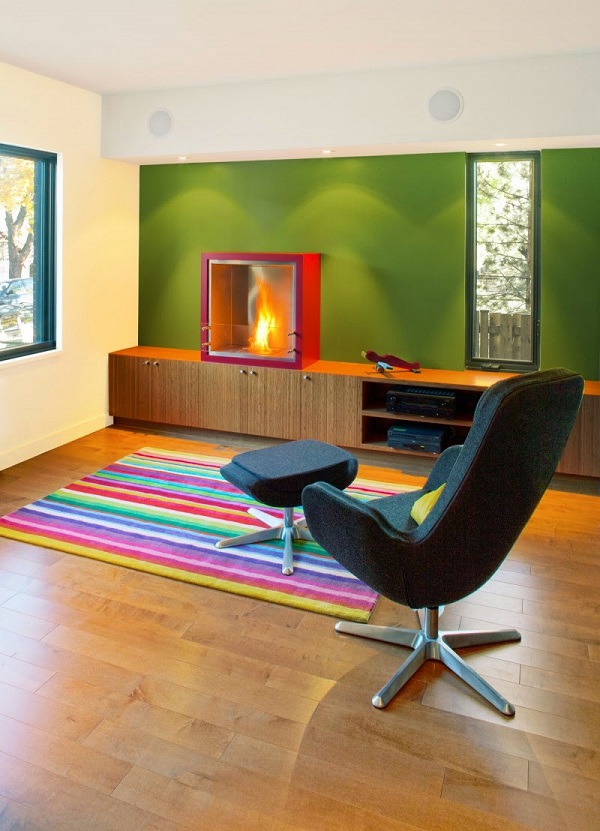
You can create a comfortable and harmonious interior not only by choosing the design of the space, but also by correctly combining colors in the interior. They are the ones who can influence the emotional and physical state person. Thanks to correctly selected color relationships, the house and its owner become an integral organism.
The color wheel is one of the important tools to create the right color combinations in the interior. Issac Newton was the first to systematize the spectrum, dividing a white ray of light into red, orange, yellow, green, blue, indigo, and violet. This was the first color scheme.
Today, color wheels consist of one, two and three discs. They show what the relationships are between the colors arranged in a circle. All the colors of the spectrum are located on the axis of the circle - primary, secondary and tertiary. For example, Itten's color wheel:
Primary colors
All colors, with the exception of white, come from primary colors. Blue, yellow and red (the triangle in the center of the circle) are the primary tones. Combinations of these three colors make up the secondary colors.
Secondary colors
The next six colors of the circle are obtained by mixing two primary (primary) colors. For example, purple is obtained by mixing red and blue, and green is obtained by mixing blue and yellow, but orange is a combination of red and yellow.
Tertiary colors
If you mix one primary color with a secondary color, you get a tertiary tone. Total - 12 colors. You can also create a tertiary color by mixing a base tone with more of another base tone to create a tertiary color. For example, one part blue with two parts red will create a red-violet color.
Advice
:
It is important which colors are located next to the tone that interests you, as well as those that lie opposite the color you have chosen. For example, yellow goes well with the opposite violet, and light green is harmonious with the color of bright pink or fuchsia. Next to yellow there are two colors with which you can create harmonious chromatic combinations.
Shades and halftones
Shades are obtained from the main color. For example, blue has light blue and dark blue shades.
. Tone is the result of adding white and black (gray) to the base color. Tone, unlike pure pigment, makes the color softer and more pleasing to the eye.
How to mix colors
The perception of color depends on the distance of the color spot from the human eye. For example, as the distance increases, green appears more bluish, yellow begins to turn orange, and orange begins to turn red.
. Saturation color tone interior depends on the lighting of the interior. Light levels range from light to dark on a gray scale. Floors and walls can reflect light, so light-colored surfaces in a room enhance brightness, while dark-colored surfaces dampen tones, making them dull.
Advice :
.The quality of brightness or depth of color shade depends on the light and shadow in the interior. Therefore, adding a gray tone to the design of a room can significantly soften the effects of different color combinations.
. If you need different shades of blue, dilute color combination interior in black shade. And then the cold tones of blue will sparkle with tonal gradations.
. To change the shade of any paint in the interior, add white. It will dilute and extinguish unnecessary brightness in the color combination.
Scale for determining color proportions
Using this scale, you can determine the proportions of tones and halftones. A safe ratio for color combinations in the interior is 70/20/10.
70% - tertiary shades in a neutral base
20% - secondary colors
10% - primary color
Advice
:
Use moderation when mixing colors! Try not to mix more than a few shades. Two or three colors in a neutral base are considered the safest.
Various color schemes
Color schemes and triads are a set of interior color combinations that work together to create a visually appealing palette. The color combinations given in color schemes can be considered classic. Of course, the possible color combinations are endless. But experienced designers feel which of the schemes to apply in practice.
Classic triad
A combination of three colors that are equidistant from each other. The use of such contrasting combinations will create a harmonious palette. You should choose one main color and use the other two as accents.
Analog triad
Combinations of 2 to 5 colors located nearby make up similar or related combinations. For example, yellow-orange, yellow, yellow-green, green, blue-green.
Complementary combinations
A complementary color (also known as a contrast color) that is opposite the second one on color wheel Itten. The combination of these colors creates a bright and exciting effect, especially at maximum saturation.
Rectangular diagram
A four-color combination is a scheme consisting of one primary color and two additional colors. The company includes one more additional tone to highlight accents. For example, blue-green, blue-violet, orange-red, orange-yellow.
Square pattern
A combination of four colors located at equal distances from each other. Dynamic colors different in tone and, at the same time, complement each other. For example: purple, orange-red, yellow, blue-green.
Rules for using a color scheme
Color combinations in the interior are conventionally divided into warm and cold. Thanks to them, you can visually enlarge or reduce the room. It all depends on the chosen basic tone. This is why the selection of complementary colors is so important. They are located opposite each other on the color wheel. Each tone brings out the richness of the other. When using complementary colors, one color should be soft and weak in tone, while the other should be more dominant. For example, an intense dark purple should be paired with light yellow shades.
Decorate adjacent rooms in similar colors. Plan your color scheme based on how visible each room is from the other. Look for related colors. For example, related tones are located next to each other on the color wheel. These colors produce less contrasting effects than complementary colors. For example, the dark tones of a blue-green room combined with the light blue colors of the adjacent room can give the feeling of floating in a blue lagoon.
Choose a base color that you like best and use as many shades of it as you can think of. For example, they give maximum effect when adding related or complementary colors. Contrary to popular belief, monochrome is not a black and white duo or one single color. True monochrome combinations often consist of one main tone and several adjacent tones. For example, green color may look quite independent and self-sufficient. It fills the entire interior space, but this is only at first glance. If you look closely, you will see tones of apple and grass, young greenery and swampy mud in shades of khaki, juicy lime and pistachio, transparent candy in yellow-green tints and olives. All these shades are successfully emphasized by white, gray, as well as interspersed tones in the colors of metal and wood. That's basically how you get monochrome!
Advice :
Choose one favorite color that will become the main color in the interior. And then add to it objects and accessories in shades and halftones of the same color, and dilute this complex monochrome range with things in neutral shades. But only a little bit - in order to shade the main palette.
First decide where you are going to use the colors in the room. General rule when decorating is to use three different meanings in a combination of colors: light, medium and dark. Walls and floors are usually designed in light colors, depending on the effect you're trying to create. The floors should be slightly darker than the walls to avoid a floating effect. Window sashes and large pieces of furniture are often created in the middle to connect light walls and floors. Dark colors should be used as color accent in the interior.
Color temperature
Some color combinations in the interior are warm, others are cold. Psychologists say that the color of a room can affect a person’s mood and well-being and evoke an emotional response in him. Some color combinations in the interior create a general feeling of calm and physical satisfaction, while others cause internal tension and discomfort. Colors can be either an ideal partner or an enemy that you will have to fight unconsciously.
Warm and cozy colors
for the interior are located on the right side of the color wheel. They radiate positive energy and the power to unite people.
Red
radiates energy, strength and passion. Restaurants and bars often use this color of strong energies because it increases appetite and promotes socializing. And it is a common choice for kitchens and dining rooms in the home. However, red should be avoided in the bedroom.
Orange
This color is considered exciting and powerful. Its presence in the kitchen and dining room is known to increase appetite and relax. Psychologists advise using orange in moderation. Orange is less aggressive than red. It creates warmth and a feeling of joy. However, it is recommended to use it only as an accent color.
Yellow
Sunny shades of yellow are associated with happiness and warmth, but rich and bright tones can increase frustration and anger. Typically, yellow is an uplifting color. When yellow is overused, it can become distracting and overwhelming. Don't let this color in large quantities in the children's room, because children are known to cry often. But using it in the kitchen in tandem with orange will cause positive emotions and even euphoria. Yellow has various effects depending on how and in what quantities it is used.
Cool and soothing colors
Cool and soothing colors located on the left side of the color wheel provide a sense of calm and a sense of trust:
. Green. It is a calming and refreshing color that reminds us of young greenery, grass, pistachios and juicy limes. It easily fits into any room. Green conveys a feeling of renewal and growth. It is used in rest rooms, such as bedrooms. It is not uncommon to see different shades of green in the kitchen. And, of course, in children’s rooms, because children love everything natural so much, especially colors associated with nature.
Blue
If you're trying to create a calm, spa-like environment, consider blue. Like green, it is a calming color and is also good for bedroom decor. Iridescent and bright shades of blue are used in offices to increase productivity. Light blue can make a room feel bright and refreshing, while deep blue creates a sense of self-worth.
Violet
This color has long been associated with royalty and wealth. It contains the calmness of blue and the energy of red. Combined with some active tones, it stimulates creativity and vitality. However, in large quantities and in tandem with red, it becomes dangerous to health, causing euphoria.
Advice :
Brown should be mentioned as the most common color in interiors. Brown consists of several colors, which are based on warm and cool tones: red, yellow and blue. Dark brown or wenge is obtained by adding black to this triad. Brown represents restraint, reliability and modesty. This is one of the most powerful tranquilizer colors, it belongs to the warm colors of the earth, and therefore has become the basis of a psychologically calming palette.
Brown fits perfectly into color combinations in the interior, for example, with gold, as well as tones similar to it in shades, for example, with yellow. If we ignore the interior, many people associate brown and red colors with warts. Follow some principles so that they don't bother you.
The appearance of purple in a brown tones suggests subtle idealized relationships and feelings. Such combinations are appropriate in living rooms and dining rooms, where an environment that brings pleasure to the body is needed: delicious food, luxury items, beautiful accessories and furniture.
Color combinations in different rooms
Before choosing a color for the kitchen, living room, bedroom or nursery, you should remember that white plays an important role in the palette.
White
- this is the basis of the spectrum. It really helps freshen up the space and makes it feel clean. Therefore, this color is always appropriate in pastel colors, combinations of various colors of a neutral palette in the interior. But even warm and hot shades from Mexican interiors allow white color, as a complementary and accentuating blue and light blue color combinations.
Pastel color combinations
Pastel colors are the result of adding large quantity white in various combinations of complementary colors. They create a comfortable, spacious feeling in any room.
Neutral color palette
Shades of white, beige, dark brown, gray and black form the basis of neutral color combinations. The neutral palette is the lightest and airiest for one obvious reason: all of these neutral shades mix with most colors on the wheel. They can be stylish and dramatic. For example, black and white, as neutral tones, create a wonderful palette of complementary shades for different base tones.
Advice
:
If you choose neutral color combinations in the interior, use bright accessories to accent walls and make interesting room. When you're ready for a change, simply change the color of your accessories.
Bedroom
The bedroom interior is usually created in soothing colors. However, through different color combinations using complementary tones, designers have opened up a lot of possibilities. For example, combinations of gray and beige colors in the bedroom interior they create the lightest and most weightless intimate spaces in which you can relax from the hustle and bustle of the day.
For example, the bedrooms are magnificent, in which pearl-pearl shades predominate, combined with a beige tone.
A bright bedroom is created when you choose one intense and colorful primary color, for example, fuchsia pink. The selected color on the color wheel is combined with light yellow. They complement each other, but by introducing white, or a similar color to yellow, khaki, you will get a more balanced interior.
A bedroom in gray colors is a “shelter” for a person seeking privacy and escapism from the bustle of the outside world. Bedroom in gray tones indifferent to the bright and conflicting outside world.
Red shades between warm related yellow, peach and orange tones, which are complemented by combinations of blue, turquoise and light blue. The impression of contrast is hidden thanks to gray shades and white, which actively participates in the overall palette.
A bedroom with color combinations, among which turquoise occupies a dominant position, looks optimistic. In such an interior, it is important to create a complex color scheme consisting of several additional tones, for example, khaki, blue, light blue. And also tones that are located opposite blue-green on the color wheel, namely beige, light yellow or even peach, but you need to feel the measure. Because when introducing warm bright colors, the room will become like a guest room for communication.
Fashionable Scandinavian style found its reflection in the bedrooms. The main tones in color combinations are brown and purple, which require the support of calm shades of gray, lilac and grass. Natural colors are combined in such a bedroom with airy shades of frosty air.
Bedroom in blue tones tends towards peace and perfection. Nothing seems to distract you from relaxation. With a minimum amount of furniture it looks extravagant. If you add islands of white and cream to blue, this will soften the pressure of blue. In rooms serving as a place of relaxation, splashes of optimistic pink are preferred. Bedroom in lilac tones
Raspberry color in the bedroom is for extravagant people. And the partner yellow and neutral black in shiny nickel colors help to enhance the extravagance of purple.
Living room
A room in gray-blue combinations is very calm, seasoned and requires the introduction of neutral tones - black and white, which dilute the harsh atmosphere of two related tones.
Blue is practically incapable of becoming boring; it is fresh, serene and promotes friendly relations between people. But dark blue combinations evoke nostalgia for the past. The situation will be corrected by small splashes of pink and purple, turquoise and white. Introducing yellow will create a joyful atmosphere in the living room.
Color combinations in neutral tones are the most beneficial theme in the interior. After all, in such rooms you can relax with your family and gather friends. From combinations in neutral color scheme you don't get tired. The main range is wenge and adjacent colors: beige and gray - all colors of the earthy palette. And yet, two or three bright inclusions would not hurt from the tones located opposite these combinations - orange and soft green, two color partners.
A living room in a green palette evokes a pleasant feeling, reminiscent of young spring grass and the first summer apples. A fresh, juicy and delicate green tone in the interior should be supported by related shades. And if you succeed, your living room will become your family’s favorite place to stay and popular among guests. And believe me, no one will want to leave you for a long time.
Two colors - pink and azure - are simply meant to be together! Additional beige, white and gray hold back the onslaught of bright fuchsia. All together they form a classic triad on the color wheel, complementing each other.
A bright room requires a combination of self-sufficient brightness tones, the basis of which is red-pink and dark gray. Tertiary shades located on the opposite side of pink and red will be no less juicy.
The ocher tonality of the living room accepts brick and orange, as well as additional tones of gray, khaki and light blue. Orange can be introduced into the design in accessories.
Bathroom
A Tiffany or Sea Breeze bathroom is a pleasant color scheme made up of related tones, the primary of which is blue.
Pink is not typical for a wet room, but if you have a pink bath, then the entire room should be dressed in pastel shades of pink, diluted with a gray tone.
Green combined with related tones and white gives an incredibly refreshing feeling.
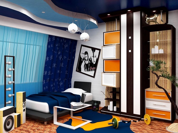
Children's
Children's room in beige tones must be combined with pink and light green flowers in delicate shades. White color will not hurt to create complete harmony.
A room in lilac tones is usually made for girls. Lilac is a tertiary color formed by two tones: secondary pink and primary blue. Lilac brings a touch of playfulness and carefree.
Kitchen
The peach dining room seems bright only at first glance; if you look closely, you can see a combination of several primary, secondary and tertiary colors in the interior. Primary yellow found partners among tertiary peach (yellow + orange), secondary light orange and beige.
Olive is a complex secondary color formed by two primary colors: yellow and green. It is part of the spectrum of green color, which carries freshness, youth and love of life. Yellow, participating in combinations with green, softens this tandem. The resulting yellow-green with a large percentage yellow symbolizes peace and contemplation.
Conclusion
The perception of color is purely individual. Therefore, when composing the palette of your interior, do not restrain yourself by the generally accepted framework, focus on your own worldview and desire to do something special. Don't forget that only your favorite colors will bring joy. A color wheel will help you create color combinations in the interior using the primary color as a basis.
The colors that are visible under natural conditions are usually the result of mixing primary colors. There are three main ways of such mixing, namely: spatial, mechanical, and optical.
Optical (additive) color mixing
Optical color mixing is based on the wave nature of light. Optical mixing can be obtained by rotating a circle with sectors painted in certain colors. The main colors in this mixture are green, blue and red. Besides them, there are two more that give an achromatic gray color. By additively mixing primary colors we get white.
To get a multicolor image, you can take three ordinary projectors with different filters for primary colors and cross the rays from them. This way you can get any color on a white screen. An area of the screen, for example, that will be illuminated both green and blue, and when adding red and blue rays we get purple. By the way, please note that when mixed, the colors are not the same.
Optical color mixing is usually done using more complex devices. A striking example is the television, the various shades in which also appear as a result of mixing green, red and
Spatial color mixing
Spatial mixing occurs when a person looks at small spots of color touching each other from some distance. These spots merge into one spot - with a new color, which will depend on the mixing of the colors of small areas.
Spatial fusion of colors is obtained as a result of light scattering. It is also influenced by the structure of the eye and the rules of optical mixing.
The artist must take into account the peculiarities of such a mixture in his work, since, most likely, the picture will be viewed from a certain distance. So, if you look at a picture drawn with small strokes from a distance, they will visually merge, and it will create the impression of being holistic.
Spatial mixing is the basis for obtaining images of color shades when printing from raster forms. If we consider areas formed by small differently colored dots from a certain distance, a person will not distinguish their colors, but will perceive the color as spatially mixed.
Mechanical color mixing
The third type of mixing - mechanical - occurs when mixing paints on paper, canvas or palette. To better understand its mechanism, you need to draw a clear line between concepts such as “paint” and “color”. There are more colors that have an optical nature than paints that have chemical properties.
As a rule, the colors of paints are less saturated than the colors of the objects around us, so young and inexperienced artists are faced with the problem of conveying colors. How to convey the variety of colors in nature with a dozen colors in a set?
However, this problem can be solved if the artist understands color science and knows how to choose the correct coloristic and tonal relationships between colors. In principle, if we are talking about artists, then sooner or later they all master the technique of mechanical mixing.
Very often, mechanical mixing of paints can produce results similar to those of optical mixing, but they are usually different. For example, while optical mixing of all colors produces white, mechanical mixing produces gray, brown, black or brown colors. There is one that will tell you what color can be obtained by mixing certain colors or rays.
Optical color mixing (additive, additive).
Example: If you put blue and yellow colors next to each other, then from a distance their combination will appear green. For the first time in our civilization, impressionists began to use this law; passing through a prism, a sunbeam is decomposed into 3 partial colors: red, yellow, blue. Where they mix at the edges, 3 components are formed: green, orange, purple. Painting cannot convey the power of color. If you mix paints on a palette, you will get a dirty background, so the impressionists began to put on the canvas individual strokes of those paints into which the color decomposes (emanating, reflecting from the surface), passing through a prism. And since the lens in the viewer’s eye is the same prism, it seems to combine colors, restoring light. Working openly, in nature, the impressionists noticed that the shadows of objects are not black, but are painted slightly in the color of the objects themselves. To work in impressionistic style, you need to learn several rules:
1. The palette is limited only to pure colors (spectral), without the so-called earthen ones - this is red lead, and so on.
2. On the palette it is allowed to mix only those colors that are adjacent in the spectrum. Example: red and orange, blue and purple. It is also allowed to whiten the color. All other mixings are carried out optically.
3. Paints are applied with small strokes, dots, punctuations, a type of impressionism. With a clear form, individual strokes do not overlap each other, but are located side by side, called punctolation.
4. The local color of any object is divided into parts in accordance with lighting conditions. Illuminated part, own shadow, falling shadow, reflex, and so on.
All these parts have their own special color, and the colors of the illuminated and shadow parts usually contrast, this is called color separation.
5. The color of a local large spot is conveyed as the sum of small strokes different colors, now strengthening, now weakening, this is called gradation.
The modern colorist is based on a three-component theory (the principle of 3 primary colors) - red 750 nm, green - 546.1 nm, violet - 435.8 nm.
Any color can be expressed mathematically, where C is an arbitrary color, x is red, y is green, z is Purple - primary colors.
X1, y1, z1 – color coefficients showing the ratio of the basic ones being mixed. Chroma, which is a derivative of hue and saturation, is more conveniently assessed using relative color coefficients:
X = x1/(x1+y1+z1)
Y = y1/(x1+y1+z1)
Z = z1 (x1+y1+z1)
The sum of the relative coefficients is equal to one: x+y+z=1
Creating the design of any space begins with color. Deciding on general style premises, the designer is already presenting it in certain tones, since they are the ones who direct imagination in the right direction. The combination of colors in interior design is one of the factors indicating the style and theme of the room. Country style is dominated by noble rich tones, all shades of wood, white, beige, burgundy, brown. To create the Provence style, pastel colors with a slight splash of color are used dark shades. The “marine” style is indicated by blue, white, gray, light blue and the color of dark wood. The classic is characterized by a wide range of beige, chocolate, and coffee. The ethnic style plays with contrasts, using brown, bardo, black, and red. The choice of colors is the most important stage, on which the success of interior design as a whole depends.
The joke that all men see only 16 colors, as in the default Windows settings, has real roots: there are many more “color-sensitive” cells in a woman’s eye.
However, as research shows, the human eye is capable of perceiving a huge number of colors and their shades: about 250 pure and more than 10 million mixed.
A simple understanding of the colors of the main spectrum will help you not to get lost in such diversity.
There are only seven of them: red, orange, yellow, green, blue, indigo, violet. Taking these colors as a basis, diluting them or mixing them together, colorists create a huge number of tones and shades for use in the interior. To them are added so-called achromatic colors, that is, those that do not carry any color meaning. There are only three of them: black, white, gray.
All colors can be divided into two groups: warm and cold:
The feeling of warmth is caused by red, orange, yellow, and all their various shades. Warm colors are used to make a room more comfortable, add light to a poorly lit room, or correct too much empty space.
The feeling of coolness is evoked by blue, violet, cyan and their various tones. Cool colors are suitable for well-lit rooms, they will visually expand the space and add freshness and vigor.
How to choose the right harmonious combination of colors in interior design?
Choosing colors and their combinations is a complex process that sometimes baffles even professional designers. But with the help of a universal, easy-to-use color wheel, anyone can now cope with the correct selection of colors. You just need to remember that within one room you should combine from three to five colors, no more.
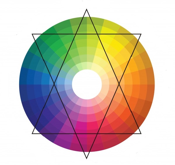
Color circle
1) Several shades of the same color
This is a proven and reliable method for calm natures who do not like to take risks too much. The room is “filled” with all sorts of shades of the same color: from the deepest, most saturated to the lightest, barely visible. Smooth transitions and a guaranteed successful combination will give the interior calm, harmony, and tranquility.
2) Playing on contrasts
A method radically opposite to the previous one. The basis is taken of two contrasting colors located opposite each other on the color wheel. Contrasts are played out in the interior using neutral colors such as black, white, gray.
3) Harmonious combinations
One of the colors in which you would like to decorate the room is taken as a basis. Two more are “attached” to it, located to the left and right of it on the color wheel. In this case, the colors will form an original and beautiful combination, without sharp transitions.
4) Three spectacular colors
A somewhat bolder move, but without being too flashy. A triangle is used to identify three colors that successfully combine with each other. It can be rotated within the circle until the angles indicate the most pleasing combination to the eye for each individual case.
Rules for choosing colors for different rooms
The influence of color on a person’s mood and emotions has not been a discovery for a long time. That is why you should very carefully select colors for interior decoration, depending on the purpose of the room.
Bedroom
It is not recommended to decorate the bedroom with sharp contrasting colors, since this place is designed to relax and soothe. Pastel colors and soft shades are perfect here. Warm colors are preferable, but cool shades can also be used if the room is small and the windows face south. Well-chosen accessories, the addition of white, and the correct placement of accents will help bring coziness to cold tones.
Living room
In the interior of the living room, you can be bolder with the choice of colors. Playing with contrasts or using eye-catching accents will add vigor and give the interior a stylish, eye-catching look. If the windows face north, you should take warm shades as the basis for the interior. If the living room is too small, you can “expand” it a little by using a light, cool palette. It is important to consider that cool tones are only good for bright rooms where the sun does not leave the room for a long time.