What is color harmony. Harmony of colors
According to emotional associations, the impact of color is divided into positive, negative and neutral. Exciting colors include red, orange and yellow. The oppressive ones are purple, dark gray and black. The calming ones are green and blue. Physical associations of colors are equally important: weight (light, heavy), spatial (protruding, deep), acoustic (quiet, loud) and textured (soft, hard, smooth).
EFFECTS OF COLOR: No companion for taste and color
This proverb as nothing reflects the reality of the impact of color. It was found that different psychotypes prefer certain color gamuts, as shown in the figure below.
For example, we can recall the colors of the youth movement "emo", based on experiences, emotions and suffering in creativity, music and style. Their main colors are oppressive black combined with pink, giving a melancholic state.
It was also found that the same colors can be associated in different ways by people. The purer and brighter the color, the more intense and stable the reaction. Complex, low-saturated, medium-light colors cause different (unstable) and relatively weak reactions. The most unambiguous are temperature, weight and acoustic associations. 
Yellow and green colors cause the greatest variety of associations, and therefore different effects of color. This is because in a given spectrum the eyes distinguish the greatest number of shades. In nature, these colors are the richest of all. Each of the shades of yellow or green is associated in the mind with a certain object, phenomenon, taste, hence the wealth of associations. Also, the purple color causes ambiguity, due to its duality.
EFFECTS OF COLOR: Harmony of color
It's no secret that some color combinations seem harmonious to us, while others, on the contrary, are absurd. To create a harmony of colors in the interior is the key to the success of a harmonious life in the house.
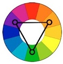
The illustration on the left shows simple color combinations in four harmonious colors. To build harmonies for other colors, you need to turn these shapes with the vertex to the desired color.
The principle of color harmony is based on diametrically distant pairs and triads, so you can find not only four harmonious colors, but also less and more by applying halftones. For example, if you do not take into account the purple color, then a classic triad is formed in the upper picture, and a contrasting one in the middle.
Do not apply colors in equal amounts. The harmony of colors is achieved through the main color (background, as a rule, less saturated) and accents. Contrast, brightness and saturation do not affect the color harmony rule in any way, the principle remains the same.
COLOR HARMONIES.
In nature, there are a large number of colors and their shades.The human eye is able to distinguish up to 360 shades. The average person distinguishes fewer shades. It depends on visual acuity, age of a person, illumination of space, on a person's mood and state of health.
Colors are divided into two large groups: chromatic and achromatic. Chromatic - "colored". Achromatic - white, gray, black.
The chromatic colors that make up white daylight are distributed in a specific order, depending on the wavelength.
Primary colors: yellow, red, blue. Composite colors: orange, purple, green.
Composite colors are obtained by mixing two primary colors:
■ Orange = red + yellow.
■ Purple = red + blue.
■ Green = yellow + blue.
All other colors consist of mixing these colors in different proportions. Plus the difference in saturation and lightness.
Colors are conventionally divided into warm and cold.
Warm colors are colors that contain yellow and red. Cool colors are colors ranging from the purple to green zone of the color wheel.
Warm colors are more dynamic, prominent and voluminous than cold colors. Cool colors appear to recede as the tone intensifies.
Color has three characteristics: hue, lightness, and saturation.
Hue - the presence of a base color in a complex color that determines its place in the color wheel.
The color tone is determined by the name of the color: scarlet, crimson.
Saturation is the difference between a chromatic color and a gray color equal to it in lightness.
Contrast in clothing matters a lot. Ornamental and rhythmic compositions are built on the contrast.
A great contrast is made by colors located on opposite diameters of the color wheel: red-green, orange-blue.
Low contrast - colors at 90 degrees to each other.
Harmony is the basis of beauty. Color harmony = color balance.
10. Harmony of combinations of chromatic colors different in color tone, saturation and lightness (pure, whitened or blackened), with different achromatic ones. 
11. Harmony of mixtures and combinations of rich chromatic colors with achromatic colors of different lightness. 
Harmony is a philosophical and aesthetic category, meaning integrity, cohesion, natural coherence of all parts and elements of a form, i.e. it is a high level of orderliness of diversity and the correspondence of parts in a whole that meets the aesthetic criteria of perfection and beauty.
Color harmony is a combination of individual colors or color sets that form an organic whole and cause an aesthetic experience.
Color harmony in design is a certain combination of colors, taking into account all their main characteristics, such as
- - color tone;
- - lightness;
- - saturation;
- - forms;
- - the sizes of these flowers on the plane, their relative position in space, which leads to color unity and most favorably aesthetically affects a person.
Signs of color harmony:
- 1) Communication and smoothness. A connecting factor can be: monochrome, achromosity, unifying admixtures or blooms (admixture of white, gray, black), a shift to any color tone, gamma.
- 2) The unity of opposites, or contrast. Types of contrast: by brightness (dark-light, black-white, etc.), by saturation (pure and mixed), by color tone (additional or contrasting combinations).
- 3) Measure. Those. there is nothing to add or subtract to a composition brought to harmony.
- 4) Proportionality, or the ratio of parts (objects or phenomena) between themselves and the whole. In gamut, it is the semblance of the relationship of brightness, saturation, and color tones. Consider the ratio of the areas of color spots:
- 1 part of the bright field - 3-4 parts of the dark field;
- 1 part pure color - 4-5 parts muted;
- 1 part chromotic - 3-4 parts achromotic.
- 5) Equilibrium. The colors in the composition must be balanced.
- 6) Clarity and ease of perception.
- 7) Beautiful, striving for beauty. Psychologically negative colors and dissonances are unacceptable.
- 8) Sublime, i.e. perfect color combination.
- 9) Organization, order and rationality.
Classical harmony should avoid color combinations in the middle range of the circle: Orange-Green, Violet-Cyan, Magenta-Orange; these colors are neither close nor distant, they, according to Goethe, do not have clarity of expression. Goethe's classic color combination:
harmoniously combine Orange-Blue, Yellow-Purple, Red-Green;
spineless juxtaposition: Yellow-Orange, Orange-Red, Red-Purple, Violet-Blue;
inharmonious combination: Yellow-Green, Green-Blue.
Combination of colors from the point of view of decorativeness. Harmony is always higher and broader than the concept of "decorativeness". Decorativeness can be characterized as a certain maximum of aesthetic quality. From the point of view of decorativeness, the traditionally harmonious triad of colors is Red, White, Black.
Explanations:
- - Badly
- -- Very bad
Depends on the degree of harmonization.
Dear friends,
when working with color, the goal of an artist, a designer is to create color harmony.
Color harmony- this is the consistency of colors with each other as a result of the found proportionality of their areas and shapes, balance and consonance, based on finding a unique shade of each color. This harmony should evoke certain positive feelings and sensations in a person.
By the nature of psychophysiological perception, it is customary to subdivide harmonic combinations into five color groups: monochromatic harmonic combinations of colors, harmonic combinations of related colors, harmonic combinations of contrasting colors, harmonic combinations of related-contrasting colors and harmonic combinations "Triad".
- Monochrome harmonic combinations built on the basis of one color. They are created by combining the selected color with its light and dark shades, obtained by adding white and black. As a result, it is possible to achieve, on the one hand, a strong tonal contrast, and on the other - subtle color relationships. The overall color tone gives the monochromatic combinations a calm, balanced character.
Monochrome harmony
Depending on the tasks set, color harmony can be organized in different light ranges. For example, using the full light range expresses calmness, stability. The selection of colors, separated from each other by different intervals, contributes to the manifestation of activity, color intensity. To express dynamic contrast, choose two colors with a small tonal interval between them and the third with a larger interval. The uniform ratio of the areas occupied in the combined colors confirms the statics, the uneven one - the dynamics.

Monochrome harmony in nature
- Harmonious combinations of related colors are achieved through the use of three colors located side by side in the color wheel. Due to the proximity of the location, these colors are easy to combine. This harmony can have a lot of depth, rich personality and elegant look. The harmony of related colors is based on the similarity of color tones (or on their slight contrast in color tone) and evokes a sense of balance and calmness.
Harmony of related colors
The introduction of a small amount of white or black into combinations of related colors leads to harmony, enhances the emotional expressiveness of the composition. Active light contrast is inherent in the harmonies of related colors, contributing to the expressiveness of tonal combinations. For example, equally saturated three color tones of the same lightness do not form subtle color combinations. As soon as black or white is added to two of the three matching colors, the color combinations become consistent.

Harmony of related colors in nature
- Harmonious combinations of contrasting colors are created by using two colors that are opposite each other in a color wheel. This technique is usually used to create accents, as combinations of these color pairs have the greatest color contrast, causing active sound, tension and dynamics of the composition. This allows one color to complement another in such a way that one of them attracts attention and the other is the background.

Harmony of contrasting colors
Starting to create contrasting harmonic combinations, first select the original color, then determine the corresponding contrasting color. By creating a harmony of contrasting colors, you can add achromatic colors to each of the combined colors.

Harmony of contrasting colors. Square
"Square"- a variety of harmonic combinations of contrasting colors of four colors, equidistant from each other.
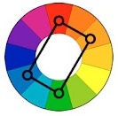
Harmony of contrasting colors. Tetrad
"Tetrad"- a variety of harmonious combinations of contrasting colors of four colors, in which two pairs of colors are located opposite each other.
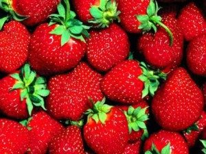
Harmony of contrasting colors in nature
- Harmonious combinations of related-contrasting colors Is the most common type of color harmony, forming an isosceles triangle in the color wheel. Here harmony is achieved through the use of any color and colors adjacent to its complementary. These colors are softer than a combination of just two complementary colors.
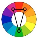
Harmony of related-contrasting colors
A characteristic feature of drawing up harmonious combinations of related-contrasting colors is the presence in the combinations of the same amount of the main and contrasting colors.

Harmony of related contrasting colors in nature
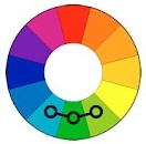
- 5... Harmonic combinations "Triad" - a combination of three colors, equidistant from each other and forming an equilateral triangle in the color wheel. This scheme is popular with artists because it offers strong visual contrast while maintaining balance and color saturation. This composition looks quite lively even when using pale and desaturated colors.
Harmonic combinations "Triad" show very distinct and strong color combinations, being, however, the most difficult from the point of view of correct creation. To achieve harmony in the triad, one color is taken as the main one, and the other two are used for accents.
Triad in nature
However, it should be remembered that in creating color harmony, not only the colors themselves are of great importance, but also the configuration of the spots, the size of the areas of the compared color tones. There is an obvious relationship between the different colors of any composition, each color balancing out or bringing out the other, and the two together affect the third. Changing one color leads to the destruction of the coloristic, color harmony of the artwork and makes it necessary to change all other colors.
Guys, we put our soul into the site. Thank you for
that you discover this beauty. Thanks for the inspiration and the goosebumps.
Join us at Facebook and In contact with
Scheme No. 1. Complementary combination
Complementary, or complementary, contrasting colors are colors that are located on opposite sides of Itten's color wheel. Their combination looks very lively and energetic, especially with maximum color saturation.
Scheme No. 2. Triad - a combination of 3 colors
A combination of 3 equally spaced colors. Provides high contrast while maintaining harmony. This composition looks quite lively even when using pale and desaturated colors.
Scheme No. 3. A similar combination
A combination of 2 to 5 colors next to each other on the color wheel (ideally 2-3 colors). Impression: calm, inviting. An example of a combination of similar muted colors: yellow-orange, yellow, yellow-green, green, blue-green.
Scheme No. 4. Separate-complementary combination
A variant of the complementary color combination, only the neighboring colors are used instead of the opposite color. A combination of a primary color and two additional ones. This scheme looks almost as contrasting, but not so intense. If you are not sure that you can use complementary combinations correctly, use separate-complementary combinations.
Scheme No. 5. Exercise book - combination of 4 colors
A color scheme where one color is the main one, two are complementary, and one more emphasizes accents. Example: blue-green, blue-violet, red-orange, yellow-orange.
Scheme No. 6. Square
Combinations of individual colors
- White: goes with everything. Best combination with blue, red and black.
- Beige: with blue, brown, emerald, black, red, white.
- Gray: with fuchsia, red, purple, pink, blue.
- Pink: with brown, white, mint green, olive, gray, turquoise, pale blue.
- Fuchsia (dark pink): with gray, yellow-brown, lime color, mint green, brown.
- Red: with yellow, white, brown, green, blue and black.
- Tomato red: blue, mint green, sandy, creamy white, gray.
- Cherry red: azure, gray, light orange, sandy, pale yellow, beige.
- Crimson red: white, black, damask rose color.
- Brown: bright blue, cream, pink, fawn, green, beige.
- Light brown: pale yellow, creamy white, blue, green, purple, red.
- Dark brown: lemon yellow, blue, mint green, purplish pink, lime color.
- Reddish brown: pink, dark brown, blue, green, purple.
- Orange: light blue, blue, purple, purple, white, black.
- Light orange: gray, brown, olive.
- Dark orange: pale yellow, olive, brown, cherry.
- Yellow: blue, purple, light blue, purple, gray, black.
- Lemon yellow: cherry red, brown, blue, gray.
- Pale yellow: fuchsia, gray, brown, shades of red, yellowish brown, blue, purple.
- Golden yellow: gray, brown, azure, red, black.
- Olive: orange, light brown, brown.
- Green: golden brown, orange, salad, yellow, brown, gray, cream, black, creamy white.
- Lettuce color: brown, yellowish brown, fawn, gray, dark blue, red, gray.
- Turquoise: fuchsia, cherry red, yellow, brown, cream, dark purple.
- An electrician is handsome in combination with golden yellow, brown, light brown, gray, or silver.
- Blue: red, gray, brown, orange, pink, white, yellow.
- Dark blue: light purple, light blue, yellowish green, brown, gray, pale yellow, orange, green, red, white.
- Lilac: orange, pink, dark purple, olive, gray, yellow, white.
- Dark purple: golden brown, pale yellow, gray, turquoise, mint green, light orange.
- Black is versatile, elegant, looks in all combinations, best with orange, pink, salad, white, red, lilac or yellow.
Color harmony is the most important means of artistic expression in painting, along with composition, drawing, perspective, chiaroscuro, texture, etc. The term "harmony" comes from the Greek word hamionia, which means consonance, harmony, the opposite of chaos and is a philosophical and aesthetic category, meaning "a high level of ordered diversity, the optimal mutual correspondence of the various in the whole, meeting the aesthetic criteria of perfection, beauty." Color harmony in painting is the consistency of colors among themselves as a result of the found proportionality of the areas of flowers, their balance and consonance, based on finding a unique shade of each color. There is an obvious relationship between the various colors of the painting, each color balances or brings out the other, and the two colors together affect the third. Changing one color leads to the destruction of the coloristic, color harmony of the artwork and makes it necessary to change all other colors.
Color harmony in the structure of a painting also has substantive substantiation, reveals the creative intention of the author. For example, Van Gogh wrote: “In my painting Night Cafe, I tried to show that a cafe is a place where you can die, go crazy or commit a crime. In a word, I tried, confronting the contrasts of pale pink with blood red and wine red, pale green and veronese with yellow-green and hard blue-green, to reproduce the atmosphere of hellish hell, the color of pale sulfur, to convey the demonic power of a tavern - a trap " ... Various researchers dealt with the problems of color harmony - Newton, Adame, Mensell, Bruckx, Bezold, Ostwald, V. Shugaev, etc. Normative theories of color harmony are not directly applied in painting, but artists working in painting, design, arts and crafts , it is necessary to know the range of scientific problems of the theory of color harmony, which can contribute to a more deliberate and rational approach to solving practical problems of color harmony. Physicists and artists have always tried to bring all the variety of colors of the visible world into a system and, thanks to systematization, determine the patterns of harmonious combinations of color tones. The first attempt to bring colors into the system was by Isaac Newton.
Newton's color system is a color wheel made up of seven colors - red, orange, yellow, green, light blue, blue, purple. Later, purple colors were added to the spectral colors, which are not in the spectrum, having received them by mixing the two extreme colors of the spectrum - red and violet. The colors of the red-yellow part of the circle were called warm, and the bluish-blue part of the circle was called cold. This was the first attempt at "color harmonization". In 1865, the artist Rudolph Adams invented the "apparatus for determining harmonic color combinations" - the "chromatic accordion". Adams' color accordion consisted of a color wheel divided into 24 sectors, and each of the sectors was divided into 6 degrees of lightness. Five templates were made for the color wheel, in which 2, 3, 4, 6 and 8 holes were symmetrically cut according to the sizes of the sectors. By moving the perforated patterns, various color combinations could be produced, which Adams called "symmetrical chords." At the same time, Adams believed that these "chords" may not necessarily turn out harmonious, but they are the basis for choosing different harmonic combinations of color tones (Fig. 1).
The basic principles of color harmony Adams formulated as follows:
- 1. In harmony, at least the initial elements of the variety of the color area should be noticeable; red, yellow and blue. If they were indistinguishable, as it would be in black, gray or white, there would be unity without diversity, that is, the quantitative ratio of colors.
- 2. A variety of tones must also be achieved through a variety of light and dark and through changes in color.
- 3. The tones should be balanced so that none of them stand out. This moment embraces quality relationships and constitutes a color rhythm.
- 4. In large combinations, the colors should follow each other in order so that a natural connection in the degree of their relationship takes place, as in a spectrum or a rainbow. In the succession of tones, the movement of the melody of color unity is expressed.
- 5. Pure paints should be applied sparingly because of their brightness and only in those parts to which the eye should first of all be directed. "
Adams' theory of harmonic color combinations was of value for the practice of painting. Albert Henry Mansell's theory of color harmony was also directly related to the practice of painting. Mensell defined three types of harmonic combinations of color tones: monochromatic harmonies - built on one color tone of different lightness, or saturation; harmony of two neighboring colors of the color wheel, built on affinity, kinship of colors; harmonies built on the principle of contrast between colors lying opposite each other in a color wheel. Mansell believed that color harmony would be more perfect if the artist took into account the relationship of colors to saturation and the ratio of the areas of color planes. The German physiologist Brücke also considered colors lying within small intervals of the color wheel to be harmonious due to their similarity in color tone. In the theory of harmonic combinations of color tones, Brücke for the first time, along with paired combinations of various colors, identified the triads of colors, which he considered harmonic. Brücke considered red, blue and yellow, as well as red, green and yellow colors to be harmonious triads of colors. In his opinion, colors of small intervals can be attached to these three colors. Bezold, like Brücke, built a theory of color harmonies on differences in colors within small and large intervals of the color wheel. He believed that a harmonious combination of color tones is obtained only when, for example, in a twelve-member circle, the colors lag behind each other by four tones, i.e. there should be an interval of three tones between them. Inharmonic color combinations, according to Brücke, are obtained when the interval between colors is only one color tone. Bezold was the first to point out the need to see the difference in the use of color and harmonious combinations of colors in painting and arts and crafts. Popular in the 19th century. was the theory of color harmony by W. Ostwald, who tried to find the mathematical laws of color harmony from the geometric relationships of the arrangement of colors within the color wheel. Ostwald believed that all colors containing an equal admixture of white or black are harmonious, and of those that do not contain such an admixture, those that stand from each other in the color wheel at an equal number of intervals are the most harmonious. Of interest is his doctrine of achromatic harmony, in which the author found a mathematical relationship between the change in the lightness of the achromatic color and the threshold sensitivity of the eye. Ostwald proved that when the lightness changes, the threshold sensitivity of the eye changes according to the law of the geometric mean. The theory of harmonious combinations of color tones, developed by V.M.Shugaev, is of great interest to artists working in the field of arts and crafts and design. The theory of harmonic combinations of color tones by V.M.Shugaev is based on the theories of Mansell and Bezold and is based on combinations of colors of the color wheel. According to the author, the circle is based on four colors: yellow, red, blue and green according to the principle of kinship and contrast. V.M.Shugaev systematized various types of harmonic combinations of color tones and brought them to the main four types:
- 1. combinations of related colors;
- 2. combinations of related - contrasting colors;
- 3. combinations of contrasting colors;
- 4. combinations of colors neutral in relation to relationship and contrast.
The author has calculated 120 possible harmonic color combinations for a 16-member circle with three intermediate colors, three intervals between the main colors. VM Shugaev believed that harmonic color combinations can be obtained in three cases: 1) if the harmonious colors contain an equal number of main colors; 2) if the colors have the same lightness; 3) if the colors have the same saturation. The last two factors play an essential role in the harmonization of colors, but are not the main ones, but only enhance the mutual influence of colors, providing a closer harmonious connection between them. Conversely, the more different colors differ from one another in lightness, saturation and color tone, the more difficult they are to harmonize. The exception is complementary colors. The harmony of complementary colors is confirmed by numerous examples in painting and arts and crafts. VM Shugaev defined color harmony as follows: “Color harmony is color balance, color balance. Here, the color balance (primarily of two colors) is understood as such a ratio and such qualities in which they do not seem alien to one another and none of them prevails unnecessarily. " "Harmonic combinations are those that give the impression of coloristic integrity, the relationship between colors, color balance, color unity."
"The colors, mutually influencing each other, conditioning each other, turn into a kind of unity called color and expressed by harmony," wrote I. Itten.
Contrast - when comparing two or more colors with each other, there are clearly pronounced differences. When these differences reach their limit, it is said about diametrical or polar contrast. So, for example, the oppositions big-small, white-black, cold-warm in their extreme manifestations are polar contrasts10.