Photoshop. Portrait retouching algorithm
At one time, computer processing of photos was considered a rather controversial idea. The possibilities of programs like Photoshop for processing photographs were used very carefully, almost secretly. In order not to end up being accused of "not real" photography. But now the processing of photography is a completely natural process and the debate, if any, is only about what is considered the boundary of reasonable processing.
However, below are 6 basic steps, in order to make the photo better with a graphics editor. We can say that this is a template scheme for basic image processing. The steps are listed in the most convenient order, from first to last.
For example, sometimes it is worth cropping a photo first, so as not to waste time processing areas that will still end up outside the frame.
You don't have to apply all the steps for every image. For example, if the image is well exposed, then level correction may not be necessary.
The steps below are just to keep them in mind as a general outline of the processing. Upon completion of the work, we recommend clicking " save as”And save the result under a different name. Thus, you will always have the original photo if you need to change or do something differently.
For most of the actions listed below, you don't even need Photoshop, almost any photo editor, even those built into photo viewers, allows you to perform these operations. In this article, for example, a "light" version of Photoshop is used - Adobe Photoshop Elements
Step 1. Crop the photo
The operation of cropping (crop, cropping) is in any photo editor. When you select a crop tool, a frame will usually appear in the picture, which you can drag on the squares at the corners or on the sides. This way you can choose what is in the frame and what is left out. In addition, you can level the horizon by making a rotational movement around the corner squares of the frame.

Also note that in some editors, the crop tool has a grid that divides the image into 9 equal parts. This is great for making your shot fit the rule of thirds.
Step 2. Removing traces of dust
If you have a digital SLR, dust often gets on the sensor. Especially when replacing one lens with another. The easiest way to spot dust is in a single-color photograph taken with the aperture clamped down. For example, at f / 16 and more, dust will be visible in the sky as a blurry dark spot.
The more the diaphragm is clamped, the sharper the spot.

Similar spots in visible areas of the image are removed with the Healing Brush tool (Lightroom, Photoshop, etc.) or with a "stamp" (Clone Stamp)
Step 3. Levels or curve
To make the photo more interesting, sometimes it is worth increasing the contrast, making the light parts of the image lighter and the dark parts darker.
The easiest tool to do this is to use the Levels tool, the more complex one is Curves.
Curves actually, the tool is not much more complex, but requires an understanding of what you are doing.
The levels are simple. In fact, you just need to look at the histogram and pull the far left (black) triangle to its left edge, and right (white) to the right. Or use the Auto Levels function

Step 4. Increase saturation
The next step can be to increase the saturation. The picture will become more juicy and vivid.
The most important thing here is not to overdo it. A shot with hypertrophied bright flashy colors looks unnatural and cheap.

Step 5. Converting to black and white
Black and white photography has always been prized in photography. Try converting the image to black white version maybe he will only benefit from it.
It should be borne in mind that a high-quality translation into black and white is not as easy as it seems. Therefore, for this purpose it makes sense to use the preset presets or ready-made solutions(plugins, actions, etc.) if there are any in the editor.

Step 6. Sharpening
Most digital photographs require sharpening. How much to sharpen depends on the particular shot and its purpose. One thing for display on a computer screen, another for printing.

Depending on the editor, one or more parameters working in combination can be responsible for sharpening.
Summarize
As already mentioned at the beginning, the purpose of this article is not to tell in detail how to process a photograph, but to outline a typical scheme of sequential actions that is usually followed when processing a photograph.

Let's repeat all the steps in a nutshell:
- Crop and rotate
- Removing traces of dust on the matrix
- Level or Curve Correction
- Increase color saturation
- Try to translate into black and white version
- Sharpen
This article brings together the most important digital photo processing techniques (also called post-processing). They don't necessarily constitute a routine that you will apply to all of your shots, but whenever you want your shot to look “right,” you will be reminded of these methods.
The post-processed snapshot more accurately conveys how this scene looks to the human eye - in most cases, this is the purpose of processing. Only white balance correction, exposure compensation, shadow restoration and sharpening were applied to the picture - all of these techniques are described below.
Overview: 10 Essential Post-Processing Techniques
The methods are listed roughly in the order in which they should be applied:
Note: The name of each method is referenced in a short summary later on this page with the most important considerations for each method. Within each summary, there are also links that will lead you to more detailed information for each of the methods.
The above methods are essentially universal, so almost any photo editing program will do. If you've shot in RAW format (which is highly recommended), the order in which these methods are applied is almost unimportant, as they will be automatically applied in the correct sequence during the RAW post-processing programs. Otherwise, the sequence is critical - especially when it comes to sharpening, resizing, and noise reduction. Be careful, over-processing of JPEG files can result in posterization of images.
1. White balance
Simply setting the correct white balance can often dramatically improve the color rendition of an image. An incorrect white balance will introduce a chroma shift in your photo and can significantly reduce both contrast and color saturation:

2. Exposure: compensation and restoration
This step assumes that you have done everything possible to get the correct exposure while shooting. However, this is not always possible (or practical).
Fortunately, exposure can be corrected using the Exposure Compensation tool. Some general advice on its application:
- Image histogram... Use it to evaluate your actions. Refer to the article "Image Histograms: Hue and Contrast"
- View... Check your small size shot on the screen for exposure. Also keep in mind that there is no "correct" exposure; it often depends on the artistic intent and just “looks right”. This topic is discussed in more detail in the article on digital exposure techniques.
- Limiting tones... Pay particular attention to highlights or loss of shadow detail. If the software you are using supports this, you may be able to restore them with "fill light restore" or "black dropper".
- Restrictions... Avoid overcorrection. If you increase the exposure too much, there will be a lot of noise in the shadows, and if you decrease it too much, the presence of highlights will become more evident. In any case, this most likely means that the exposure of the picture was incorrect, and perhaps it would be better to take it again.
3. Noise reduction
If the photo was taken at a high ISO sensitivity, it will likely benefit from noise reduction:
- Order... Noise reduction is most effective when applied before any processing (except for the two steps mentioned earlier: exposure compensation and white balance).
- Varieties... Visual noise is different; some of its types are easy to remove, others are difficult. Fortunately, noise caused by high ISO is relatively easy to deal with. The article on visual noise covers this topic in more detail.
- Restrictions... Use noise reduction rather than noise reduction, as the latter can make subjects look unnaturally smooth. Some amount of noise is acceptable and even expected.
- Special programs... In the case of problematic images, it may be worth trying special noise removal programs such as Neat Image, Noise Ninja, Grain Surgery or their equivalents.
- Sharpness... Noise reduction often goes hand in hand with sharpening, so it may be necessary to use it in conjunction with the fourth step (depending on the program you are using). This is due to the fact that they can affect each other: sharpening amplifies noise, and noise reduction often reduces sharpness.
- In some cases, you can apply noise reduction by averaging images
4. Lens Correction
The three most problematic (but fixable) lens imperfections are:
| Vignetting | Distortion | Chromatic aberration |
|---|
- Vignetting is strongest at low f-stops, although some lenses are also stronger than others. Slight vignetting is often beneficial as it draws attention to the center of the image and makes the edges of the frame softer. Also note that vignetting correction increases visual noise around the edges. However, if vignetting is caused by physical obstacle(for example, a hood or a filter), unfortunately it cannot be fixed.
- Distortion(distortion) is most pronounced when you are using a wide or telephoto lens (or when using the near or far end of the zoom lens). Do not try to fix them until they are visually noticeable, as doing so will reduce the edge resolution and change the composition. Distortion is often acceptable in landscape photography, but unacceptable in architecture photography.
- Chromatic aberration(CA) are most noticeable at low f-stops around the edges of the image and in areas of high contrast detail. When adjusting the CA, use the high contrast luminance gradient at the edge of the frame as a reference.
However, keep in mind that not all CA types are easy to remove. If CA cannot be corrected with standard instruments, you can try using other methods. For example, Lightroom and Adobe Camera RAW have a fringing tool that can reduce even the most stubborn CA views (but at the risk of reducing detail).
5. Detail: sharpness, clarity and local contrast
The purpose of this step is to correct the anti-aliasing inherent in the camera sensor and lens ("input sharpness"). It is important to use it conservatively because you will also be applying "output sharpness" later on. Sharpening should be done carefully as it can exacerbate other image quality problems (such as visual noise, chromatic aberration, etc.). However, when applied correctly, it can have a huge impact on the subjective image quality:
The basics of the methods used are covered in the following articles:
- Sharpening images (a hands-on overview)
- Sharpening with a mask (Learn about how an unsharp mask works)
- What is sharpness (factors affecting sharpness)
- Enhancing local contrast (clarity enhancement method)
6. Contrast: levels and curves
Pictures taken against the sun or near a bright indoor light source often have low contrast (because they are affected by lens flare). Increasing the contrast often gives the images the always demanded "volumetric" look:
- Excessive contrast can make the image look unnatural if the original contrast was the hallmark of the image (when shooting in fog or haze).
- Increasing the contrast also makes the colors appear richer.
Details are described in the following articles:
- Using levels
- Using tonal curves (Photoshop and other imaging software)
7. Composition: perspective and framing
Most pictures can be greatly enhanced by simply cropping to enhance the composition. Although there are no universal rules, some good principles set out in the article "Composition: the rule of thirds".
 |
 |
| Original shot | Cropping |
When cropping, you can also relate to the selected print size (for example, 10x15 cm). Cropping aspect ratios can often be set in an image processing software, thereby greatly simplifying the process.
8. Retouching: color rendering and selective correction
- Color rendering- Correction of saturation, atmosphere and other aspects. However, they often go too far with this, and this stage may not be necessary at all if the white balance, exposure and contrast were selected appropriately.
- Selective correction- Removal of traces of dust or handicaps (as shown above), creative sharpness (for example, in the eyes of a model in a portrait) and selective noise reduction (in initially smooth skies or skin). TO important tools includes the Healing Brush, Clone Stamp, Layer Masks, and Adjustment Brushes. See the help for the image processing software you are using, or scroll through the context menus to see which of these tools are available to you.
When finished, do not forget to save a copy of the image., since all subsequent stages of processing depend solely on the method of further publication of the image. This saves you the trouble of repeating all the previous steps whenever you want to use the image for other purposes. In any case, at this stage the image on the screen should look complete.
9. Size: increase for print, decrease for website
Whenever you change the display size of your snapshot, you need to resize the file (using a process called digital image interpolation). The resizing strategies can vary significantly depending on whether you want to enlarge or reduce the image.
When enlarging a picture for printing:
- Always try to increase yourself, do not leave this work at the mercy of the printer (otherwise, it is easy to get visible digital distortion).
- If you see halos around contrasting edges, you may have overdone the input sharpness intensity (or set the radius too large).
- Optimizing Digital Image Enlargement "
When reducing a snapshot for a website or sending by mail:
- Avoid unnatural patterns such as the moire pattern shown below.
- See also the article "Reducing snapshots for sites and mail"
In any case, often much more important than the reduction method is the use of output sharpness (in the next step).
10. Output Sharpness
Output sharpness is usually the final stage in image processing. As a consequence, its setting depends on the selected display device and may take into account special considerations based on size, type and viewing distance of the picture. The output sharpness can also compensate for any blur caused by zooming out for a website or mail.
- Backups... When you're finished, don't forget to back up your snapshot. It would be a shame to waste the time and effort spent on image processing (not to mention shooting).
- Calibrating your monitor... Time spent processing images is only useful when your screen is properly configured. If you haven't already, check out our article on monitor calibration for digital photos, which goes into detail.
It happens that a photo needs minimal processing, it happens the other way around.
Each person determines the amount of processing and the degree of interference in the photo for himself. This is a personal choice and taste, so I will not dwell on this. As well as on how what and why is done, here it is more convenient to whom. As you know, the same thing can be obtained in different ways.
Perhaps someone will disagree - I do not pretend to be an absolute truth, just my personal approach. This is not a step-by-step lesson, but an algorithm. Therefore, the material is designed primarily for those who already have experience in photo correction in Photoshop, and not for beginners.

So, let's begin.
- Let's open the image in Adobe Photoshop, exporting from RAW with the settings of our choice in 16-bit mode, in order to reduce the degradation of the photo quality and "tone compression" during processing.
- Then cleaning the skin, background and removing unnecessary elements. I usually use the Healing Brush Tool, Clone Tool and sometimes a little Patch Tool.
- If necessary, we fight redness of the hands, ears, nose, legs and other parts of the body. IMHO, the carefully applied Hue / saturation (sometimes combined with a mask) is second to none.
- Straightening the skin. I prefer the Frequency Decomposition method as it is the fastest, highest quality, completely manually controlled and allows the maximum preservation of skin texture.
- Fixing Shapes - Liquify is a great and powerful tool, in most cases I get by with it, sometimes, however, Warp mode (in Free Transform) can be useful.
- Correcting makeup, working with details. We draw eyes, add brightness and saturation to the iris, bleach whites, work with lips, etc. It's a matter of taste and the main thing is not to overdo it.
- After that, when you can see what we are working with, we proceed to drawing the volumes. Draw shadows and highlights / highlights. Here whoever loves, I'm in recent times I prefer to work in two layers, one in Screen mode, the other in Multiply, and use a brush color that matches the color of the treatment area. When finished, you can blur these of our 2 layers a little to soften the transitions if the strokes seem rough or visible.
In fact, I sometimes change points 6-7, depending on my mood and on what is more annoying and whether it is necessary to correct the cut-off pattern.
- Final color correction, adjustment of contrast, brightness and toning (we perform the initial adjustment and color correction even before starting Photoshop in the RAW converter). Here are the ways you want. The taste and color of the markers are different.
- The final stage. Analysis of work, sharpening and saving the finished photograph. We look at what we missed, what has gone out of sight, if everything suits us, we fix it. Sharpen the version for printing or for a reduced copy for publishing on the web. We translate the photo into sRGB color space, into 8-bit mode and save.
In the example photo, for some reason I really wanted to draw something similar to the lights in the "bokeh". Unfortunately, I didn't have a photo with real lights for overlaying, so I just added 3 layers of multi-colored specks, and blurred them to varying degrees with Lens Blur, adding a drop of noise and setting different transparency of these 3 layers. Normal and / or Screen modes.
At this stage, I never pretend to be photorealistic, but, in my opinion, it is better with them.
For those interested in the before / after photos, a little larger and a crop with leather.


How far can you go?
The first part describes the retouching algorithm in the form in which I personally see it.
I would like to point out that the before / after example was deliberately chosen to be quite grotesque, just to show you how far you can go.
There is a question about the degree of interference in the appearance of the model, where is the line that cannot be crossed. It is clear that for each type / genre of shooting, it is different.
Today there will be a simple example, according to the same algorithm that I suggested above, but with a much more gentle approach.
As you can see, using the same algorithm, you can get a much softer and more natural photo.
© 2013 site
This article is a logical continuation of the article "How to use Adobe Camera Raw", which covers the basics of editing RAW files.
Anything that can be done with a photograph within Adobe Camera Raw should be done there: this is the approach that will minimize the loss of quality. First of all, this concerns global changes in brightness, contrast and color saturation. Almost any manipulation in Photoshop leads to some degradation of the image, while RAW converters do non-destructive editing. In other words, try to make the photo as close as possible to the final idea at the exit from ACR, and leave it to Photoshop, so to speak, fine finishing, i.e. removal of foreign objects, local lightening and darkening, delicate noise suppression, image resizing and sharpening. Fine-tuning brightness, contrast and saturation in Photoshop is permissible, but only with extreme caution.
Now I use Adobe Photoshop version CS6 (13.0), but almost all the techniques that I will use in this example are feasible in earlier versions, starting somewhere with Adobe Photoshop CS (8.0). In general, a characteristic feature of Photoshop is that almost any task can be solved in a dozen independent ways, and the best of them will not always be the most obvious. I use what works the best way to achieve my goals, but it is likely that your paths will differ from mine.
My photo processing algorithm is not static - I am constantly experimenting and trying new approaches - however, the process I use today looks like this:
Not every photo needs all of these steps. Editing is not done because of the good life, but because of the unwillingness to come to terms with the flaws of the image. My goal is to bring imperfect photography in line with my ideal idea. If the shot is initially flawless, then all editing comes down to resizing and sharpening.
Before making any changes, I prefer to duplicate the active layer and work with a copy of it. For many tools, it is possible to create special adjustment layers. It is convenient to adjust the intensity of the changes made by varying the degree of transparency of the corresponding layer. If some effects are to be applied only to a part of the image, you should use masks (see "Adobe Photoshop: layers and masks").
Remember to periodically save intermediate results in PSD or TIFF, in case of possible system failures or power outages.
1. Removing garbage
The more attentive you are at the moment of shooting, the less time you will have to spend on retouching the photo. Sometimes it is enough to take a step to the left or to the right so that an object you do not like disappears from the field of view or is obscured by elements of the landscape. But it also happens that the "garbage" present in the frame turns out to be difficult to remove and forces the photographer to come to terms with its presence. I mean not only garbage in the literal sense of the word, such as bottles and bags around tourist camps, but also all other "unnecessary" objects: high-voltage wires or a trace from an airplane crossing the beautiful sunset sky; random passers-by in the background; a dog with a raised leg; flare from a bright light source; pimple on the face of the model; a speck of dust on the camera sensor, etc. It is not difficult to get rid of all this with the help of Photoshop.
Before starting retouching, I advise you to duplicate the working layer by pressing Ctrl / Cmd + J.
To remove small debris on a uniform background, I use the Spot Healing Brush Tool - J key. If the healing brush fails, you can use the Clone Stamp Tool (S). For large areas with a clear texture, it is a good idea to use Content-Aware Fill, although it does not always work smoothly (to fill a selection, press Shift + F5 and select desired option fill).
Having removed everything unnecessary from the frame, you can glue the retouched layer with the original one by pressing Ctrl / Cmd + E.
I hope the reader will forgive me for the lack of garbage in the photograph of the valley in the Skole Beskydy. There was enough garbage in the park, but I managed to exclude tourist tents and the accompanying mess from the frame even at the stage of layout. However, even if the photo looks clean at first glance, do not be too lazy to scour it all over at 100% magnification in search of previously unnoticed defects and easter eggs... Not all of them are compatible with the commercial use of the image. For example, in images intended for sale through photobanks, the presence of registered trade marks, as well as people who have not signed the release of the model.
2. Contrast correction
As I already said, it is highly desirable to determine the overall contrast at the stage of processing in Adobe Camera Raw, but the local contrast is often more convenient to correct in Photoshop. Yes, ACR has tools like the Adjustment Brush and Clarity, but Photoshop's tools allow you to be more precise and precise.
I would like the two mountains flanking the valley to the left and right to look more prominent. There are many ways to correct contrast, but the most universal tool- curves.
Create a curve adjustment layer by clicking on the Curves icon in the Adjustments palette or by choosing New Adjustment Layer> Curves from the Layers menu. With the help of two additional points, we will give the curve an S-shape. I selected the location of the points empirically, so that one of them corresponds to the lightest trees covering the right mountain, and the second to the darkest areas between the trees. By raising the light point and lowering the dark one, I increased the difference between the lightest and darkest parts of the mountain slope, as a result of which the trees on the slope became much more prominent.

But if the mountains now look good, then the overall contrast of the image has become clearly excessive and hurts the eye, and after all, I promised you only a local increase in contrast. The layer mask will help us to hide the areas of the image that should not be affected by the action of the curve. The white rectangle to the right of the Curves layer icon means that the mask is opaque, i.e. the entire adjustment layer affects the underlying image. Invert the mask. To do this, click on the white rectangle and press Ctrl / Cmd + I. The rectangle turned black, and the image returned to its original form - the layer mask became transparent, and now the curve does not affect the underlying layer.
Now you need to develop the adjustment layer only where you need to increase the contrast, i.e., roughly speaking, paint part of the layer mask white. Let's use a brush (Brush - B). In the top toolbar, set the Hardness to 0% and the Opacity to 25% or less. The brush size is around 500 pixels. It is convenient to adjust the size using the [and] keys. The larger the size, the less noticeable the border of the affected area will be. Make sure the layer mask is selected and the brush is white (the D key resets the foreground and background colors to their default values (black and white), and X swaps them). Gently brush along the mountain slopes, observing how the desired relief appears. The density of the brush is low, therefore, where a greater effect is required, it should be carried out several times. To fix a sloppy stroke or reduce the intensity of an adjustment layer, you can invert the foreground and background colors and tint where necessary with a black brush.

Here's what I got (hover over for comparison):
If you find it difficult to work with curves, then I can recommend two more alternative ways to increase local contrast.
First, you can duplicate the working layer and apply a High Pass filter (Filter> Other> High Pass) to its copy with a radius value of about 25 pixels. The Blend Mode of the layer should be changed to Soft Light or even Hard Light if you want a more pronounced effect. Turn on the layer mask (Add Layer Mask icon at the bottom of the layers palette), invert it to make the layer invisible, and paint over the areas where the contrast is needed with a white brush.
Secondly, you can again, by creating a copy of the layer, apply unsharp masking to it (Filter> Sharpening> Unsharp Mask) with the parameters Radius 25, Threshold 0 and Amount 50-100. Then, as in the previous case, use a layer mask and a brush to emphasize the contrast only in the areas you want.
3. Selective dimming and dimming
Lightening or darkening certain areas of an image is an important technique designed not only to show or shade details in shadows and highlights, but also to shift the compositional accents of photography. By lightening some areas and shading others, you can highlight the most significant elements of the composition and distract the viewer's eyes from secondary elements.
In our example, I would like to slightly darken the peripheral areas of the frame to direct the eye towards the center of the frame. In addition, the mountain on the left, as well as the very foot of the distant mountain, are also pale and need to be darkened.
Again curves will help us.
Create a New Curves Adjustment Layer. One point is usually sufficient to darken or lighten an image. I put a point in the center of the curve and drag it down - the photo has darkened.

Now, in the usual way, I neutralize the adjustment layer with black mask and with a white brush I darken the desired areas.

Lightening is done in a similar way, but this photo does not need lightening.
There is a possibility of lightening and darkening without resorting to curves. Create a new layer (Create New Layer button or Ctrl / Cmd + Shift + M) and fill it neutral in gray by pressing Shift + F5 and choosing 50% Gray. Change the blending mode of the layer to Soft Light or Overlay - the layer will become transparent. Now you can paint directly on the transparent layer with white or black, lightening or darkening the underlying image, respectively.
4. Increase color saturation
Usually the saturation increase done in Adobe Camera Raw is enough for me, but sometimes I want to make the picture even more juicy. In my experience, using the Channel Mixer for this purpose produces a much more harmonious and less traumatic image than traditional Hue / Saturation and even Vibrance tools.
Create a new Channel Mixer adjustment layer. Select the Red Output Channel and set the following parameters: Red + 150%, Green -25%, Blue -25%. Now select the green channel and enter: Red -25%, Green + 150%, Blue -25%. For the blue channel: Red -25%, Green -25%, Blue + 150%.

The colors became defiantly acidic. Let's soften their intensity by reducing the density (Opacity) of the adjustment layer to an acceptable level. In this case, I am satisfied with 15%.
It should be noted that I quite often deliberately go too far with the parameters of this or that effect in order to better see possible consequences, as well as for the convenience of fine-tuning, and only then I reduce the layer density to my liking. In the case of the Channel Mixer, for example, it is much more convenient to adjust the saturation by changing a single Opacity parameter, rather than re-adjusting the parameters of each channel several times.
Like many other routine operations, it is advisable to add the creation of a Channel Mixer layer with the appropriate parameters to the action, so that later it can be called from the Actions palette with one click.
5. Suppression of noise
Noise can be found in absolutely any digital photograph. Another question is what noise level is acceptable for you? In commercial photography, the quality criteria are quite strict, but in amateur photography they can be quite liberal. The picture in question was taken in clear weather at ISO 100 and was not subjected to extreme manipulation, and therefore, although it will be offered for sale, that small portion of noise reduction, which was made during editing in Adobe Camera Raw, is quite enough for it.
High ISO values, slow shutter speeds, and aggressive post-processing make noise much more noticeable, especially in shadows and evenly colored areas of the image, such as cloudless skies.
To reduce noise, I usually duplicate the layer and apply some kind of noise reduction filter to it, for example Filter> Noise> Reduce Noise with rather strict parameters: Strength 10, Preserve Details 0%, Reduce Color Noise 0%, Sharpen Details 0%. Then I make the layer invisible with a mask and carefully reveal it in areas where the noise is especially intrusive, being careful not to blur it. small parts Images.
Where details are not important, for example, in areas out of focus, you can use a regular Gaussian Blur with a radius of a couple of pixels.
There are tons of third-party Photoshop plugins like Imagenomic Noiseware or Neat Image that are also more than useful for noise suppression, but since I rarely shoot at high ISOs, I usually manage to get by with the standard ACR and Photoshop tools.
6. Image resizing
The simplest way to improve the quality of an existing image is to reduce the resolution, since there are more than enough megapixels in modern cameras. When you reduce the size of the photo, flaws such as shake, noise, minor autofocus misses become less obvious.
The quality of my photo is quite decent, but I still reduce its resolution from 16 megapixels to 8 to make it clearer and reduce the size of the final file.
Before resizing, I merge all layers by pressing Ctrl / Cmd + Shift + E.
Next, let's call the Image Size dialog box (Alt / Option + Ctrl / Cmd + I). The current dimensions of the image are 4928 × 3264, i.e. 16,084,992 pixels or approximately 16 megapixels. I will enter the new values 3476x2302, which is approximately 8 megapixels.
If the quality of your photo is particularly demanding, for example, you are preparing it for an exam paper at Shutterstock, downsizing is a very smart solution. Do not forget that in many photo banks there is a limitation of the minimum resolution of taken photos, and therefore it is advisable not to compress your images to less than 6 megapixels.
In order not to waste time each time calculating specific image sizes, I recommend that you install the extremely useful Size Helper plugin from Anatoly Samara, which automatically adjusts the image size to the specified resolution.
For images intended directly for publication on the Internet, I reduce to no more than 600 (for articles) or 900 (for gallery) pixels on the long side.
7. Sharpening
The nature of digital photography is such that almost every shot needs artificial sharpening, even if you did it right during the shoot. When shooting in JPEG, the sharpness is increased even in the camera, and when manually processing RAW files, you have to do it yourself in a graphics editor. The advantages of manual sharpening are that, firstly, you can more finely control the effect parameters, and secondly, you can sharpen not over the entire field of the frame, but selectively, for example, only for those objects that are in focus. Sharpening, on the other hand, in areas where it is not required, such as the sky, shadows devoid of detail, or out-of-focus blurry areas, leads to additional manifestation of under-suppressed noise and other harmful artifacts.
For sharpening I use unsharp masking (Filter> Sharpening> Unsharp Mask).
First of all, I copy the working layer (Ctrl / Cmd + J) and apply the Unsharp Mask filter to the copy with the following parameters: Amount 150; Radius 0.5; Threshold 0. Usually this level of sharpness is overkill, but I'll fix it soon.

The blend mode of the layer should be changed to Luminosity to avoid the amplification of residual chromatic aberrations.
Now I need to create a mask that only exposes the areas of the image where the sharpening is needed. In this kind of landscape, almost everything should be sharp, except for the sky. Since the sky is a relatively monotone colored area, I'll use the Color Range Selection Tool (Select> Color Range). In the window that opens, in the Select column, select Sampled Color, and then specify an arbitrary point in the sky with an eyedropper. All areas of a uniform color are highlighted. If you now drag the eyedropper across the entire sky while holding down Shift, areas will be added to the selected area that have different shades from the original of blue color... The Fuzziness parameter allows you to expand or, conversely, narrow the color range.

Clicking OK, we will get a selection area that roughly coincides with the sky in the landscape, but the selection obtained using the Color Range almost always needs additional correction.
First, I invert the selection by pressing Ctrl / Cmd + Shift + I so that the selected areas are exactly the areas in which I plan to sharpen. Then I slightly blur the borders of the selection using the Feather Selection command (Shift + F6) with a radius of 1 pixel. Now I will press the Q key, thus turning on the quick mask mode. Areas marked in red not subject selection, the selected areas are visible without interference. Now, with the help of a soft brush, you can correct the future layer mask. White brush adds a selection, and black removes it.
Press Q again and return to the standard selection view. Create a layer mask by clicking Add Layer Mask in the layers palette. You can temporarily make the bottom layer invisible by clicking on the peephole in the Background layer to evaluate the quality of the mask.

Before stitching the layers, zoom in to 100% or even 200% and make sure you are happy with the sharpening result. In this example, I would prefer to slightly reduce the intensity of the unsharp masking by setting the layer density to 75%, and only then press Ctrl / Cmd + Shift + E.
Compare the portion of the image after sharpening with the original.
In situations where sharpness to the horizon is not required, and only individual objects or even their fragments fall into the area of sharpness, I proceed more simply and do not resort to Color Range or other clever selection methods. For such shots, I simply hide with a black mask the entire layer to which the unsharp mask was applied, and then add sharpness with a white brush where necessary.
If the image is small and intended for publication on the Internet, I restrict myself to applying an Unsharp Mask to the entire frame with the following parameters: Amount 150; Radius 0.3; Threshold 0.
Instead of the Unsharp Mask, you can in all cases use the Smart Sharpen filter, which has even more flexibility in settings.
An alternative way of sharpening is to create a copy of the working layer, apply a High Pass filter with a small radius (no more than 1 pixel) to it, and change the blending mode to Soft Light or Hard Light. Further, the procedure will be the same as described above. Use whichever method suits you best.
Saving an image
If you do not exclude the possibility that sometime in the future you will need to return to editing the newly processed photo, it should be saved in formats that do not allow degradation of quality, i.e. PSD or TIFF. I prefer the TIFF format because it supports lossless LZW compression, which can painlessly reduce file size.
I then convert the commercial photographs to JPEG with the highest quality possible (12).
Let me compare the result of processing in Adobe Photoshop with the original image obtained using Adobe Camera Raw.
Thank you for the attention!
Vasily A.
Post scriptum
If the article turned out to be useful and informative for you, you can kindly support the project by contributing to its development. If you don't like the article, but you have thoughts on how to make it better, your criticism will be accepted with no less gratitude.
Please be aware that this article is subject to copyright. Reprinting and quoting are permissible provided there is a valid link to the source, and the text used should not be distorted or modified in any way.
When reading articles about Photoshop, I am often amazed at how many authors make it difficult to solve inherently simple processing tasks. Many "monumental" writers suffer from this, for example Dan Margulis. But this is forgivable to him - his task is to write about all the subtleties and nuances of the processing process, to consider it from all angles and sides. Although it is precisely this feature of the presentation of material in his books that repels many readers.
In fact, the roots of these "40-step sharpening" techniques have their roots in a very simple thing - the people who write these tutorials have never worked with a lot of photographs. That is, as a rule, they have a couple of photos and they are ready to kill an evening or two in the process of processing them. But when you have constant orders, and from each photo session you need to seriously process several dozen frames, you start to think about simpler and convenient ways processing.
We will talk about them today. I’ll tell you about five simple but very effective Photoshop tools which I constantly use in my work.
Before editing photos in Photoshop, I always work with the frames in the RAW converter first. It is there that I do the main color correction and primary processing of photos. Basically, I create a "skeleton" of processing, and in Photoshop I work with the details of the photo.
So, we have worked with the photo in the RAW converter and open it in Photoshop. Photoshop meets us with a huge number of processing tools for all occasions. But we'll talk about the simplest and most effective ones.
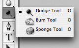
The main function of the Dodge Tool / Burn Tool is to lighten / darken individual areas of the image. Basically, you can "paint" the darkening, or vice versa - lighten the picture. It's very simple, give it a try: I am sure you will appreciate this tool. The Dodge / Burn Tool has only two, but very important settings.
Range - Select a field of application
You can use this tool on dark (Shadows), light (Highlights) or neutral (Midtones) areas of the photo. For example, you want to lighten the dark areas of the chin (when processing a portrait), and leave the light ones untouched. In this case, we set the Shadows mode to the Dodge Tool, and it will only lighten the dark areas of the places where we apply it.
Exposure - force of impact
It is very important to correctly set the strength of the impact. Many people experimenting with Photoshop try 100% Dodge / Burn. And, darkening the image, get black "holes", and lightening - solid overexposures. Of course, when they get such a result, they no longer come back to this tool. But Dodge / Burn is a subtle tool. If you are working with shadows or highlights, try the application strength of 7-10%, if with neutral areas - 10-20%. For each case, the strength of the impact is selected separately, but after working a little with this tool, you will begin to feel what kind of power is needed in each specific case.
Usage
Dodge / Burn has a ton of uses:
- Lighten the iris of the eyes
Just apply the Dodge Tool to the iris - this is the easiest way to lighten it. Thus, you focus the viewer's attention on the model's eyes.
In all these portraits, I brightened the iris of the eyes precisely in order to draw the viewer's attention to the eyes and add psychology to the frame.

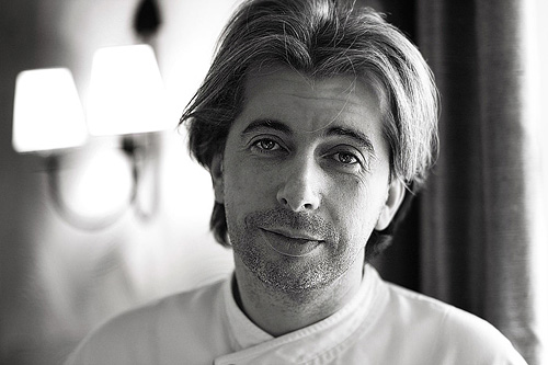
- Darken the lines of the face in a male portrait
Cheekbones, jawline, nose line, eyebrows - any facial lines, if darkened a little, will acquire greater volume and contrast. The man in the photo will look more tough and strong-willed.
I use this technique when processing almost all male B / W portraits. For color, this technique is not always suitable, as it “destroys” colors, but it works just fine in B / W picture.

In a woman's portrait, this technique must be used very carefully, since a woman will be adorned only by accentuating those facial lines that give her femininity. Otherwise, you will receive a portrait of a masculine creature.
- Brighten backlight areas
Backlight is a wonderful thing in itself. But if you use the Dodge Tool to enhance its effect, the picture will become even better. It looks especially great in concert photographs, when the musicians are illuminated by good backlighting.

- Whiten teeth for your models
It is using the Dodge Tool that it is easiest and most effective to whiten teeth in a photograph. A little later, I will definitely write a separate lesson on correct teeth whitening with the Dogde Tool.
2. Clone Stamp

There are several tools for retouching images in Photoshop, and each of them is good in its own way. But "Stamp" is the most versatile tool to use.
Its function is to take a certain area of the image and copy it. Thus, we can, for example, retouch wrinkles - simply "replacing" them with areas of smooth skin. To do this, press Alt and select the area from which the picture will be taken, and then, simply by clicking on the right sites images, we will copy it to them.
It is important to pay attention to two parameters in the stamp settings:
Mode
These are the modes in which the stamp will work. For example, in Darken mode, the stamp will only "replace" areas that are lighter than the selected area. In fact, you can darken the light areas of the image, which is why the name of the mode is Darken. And, accordingly, in the Lighten mode, the stamp will work only on the darker areas of the image, lightening them.
Clone Stamp has many modes of operation - experiment with them, I'm sure you will get interesting results.
To describe the operation of each mode, in my opinion, does not make sense - in Photoshop for all tools, essentially the same principles of operation of the modes operate, only slightly changing for the specifics of a particular tool.
Opacity stands for opacity. Simply put, the lower you put the percentage in this setting, the more transparent the "work" of the stamp will be. For example, at 100% the stamp will completely replace the selected area, and at 50% it will be semi-transparent. For face retouching, as a rule, 10-30% is used, otherwise the stamp mark will be too clearly visible.
Using the Clone Stamp
- Retouch
Retouching in all its forms is the main purpose of the stamp. First of all, the stamp is used for skin retouching - to remove wrinkles, bruises under the eyes, swelling and other beautiful creations of Mother Nature.

You can also retouch, for example, an unwanted subject in the frame. Unless, of course, it takes up half of the photo.
It is very convenient to use a stamp to eliminate small overexposures. For example, your model has a small speck of overexposure on the tip of her nose. We take a stamp, set the Darken mode and darken this speck in a couple of clicks.
3. History Brush

History Brush is a time machine for photo processing. You can take any stage of processing and paint with a brush from it according to your image.
The History Brush is fraught with tremendous possibilities. I have already written in detail about the operation of this tool in a separate article. In it, you will find a detailed tutorial on the use of history brushes and learn how to sharpen only the areas of the image you need.
Sharpening is certainly not the only area of application. In future articles, I will tell you how to work with color in a photo using the History Brush.
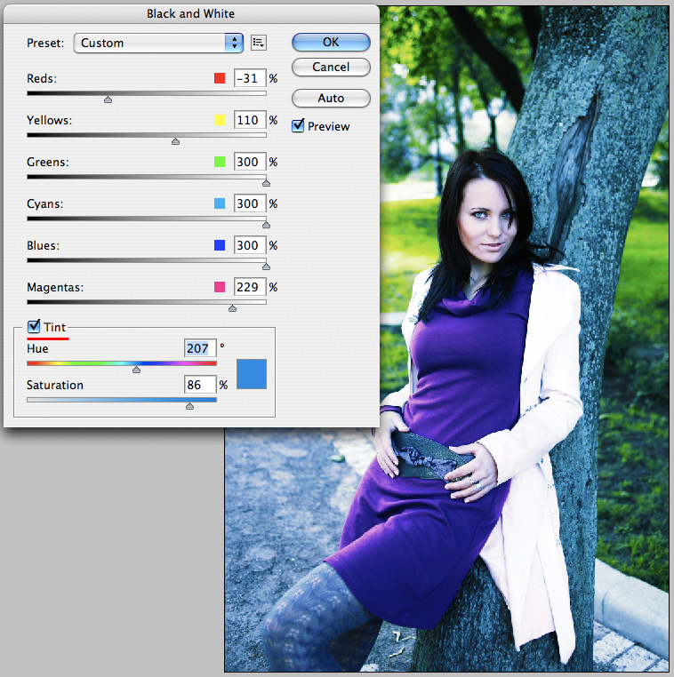
4. Black & White
The Black & White tool is located in the Image-> Adjustments tab. Or you can just create an Adjustment layer on your photo.
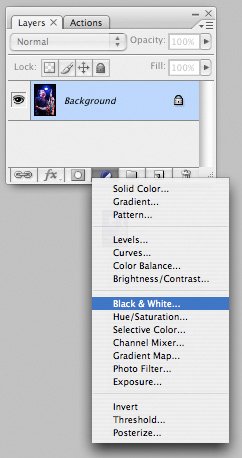
The main function of the Black & White tool is the "correct" translation of a color image into b / w. Correct because you can change the black and white display of each color. Thus, you can get a beautiful and "tasty" b / w picture.
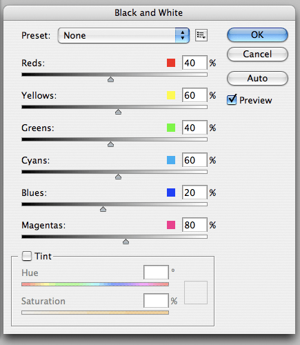
But the functionality of B&W is not limited to this.
With this tool, you can get a very interesting and colorful picture. Apply a B&W to our image and then turn on the Overlay layer mode.
Now, by manipulating the B&W controls and layer transparency, we can get a very interesting picture. For better clarity, I set the Opacity of the B&W layer to quite high - 62% and turned the Greens, Cyans, Blues and Magentas controls to the maximum.
As we can see, the picture immediately became richer and more contrasting (click on the picture to enlarge).

Now let's pay attention to the check mark Tint... By enabling it, we will be able to tint the image in the color we need.
Usage
The options for using B&W in both color and B / W are a lot.
In one of the following articles, I will, using the example of processing several photos, talk about all the main nuances of working with Black & White.
5. Shadow / Highlights

Shadow / Highlights is also located in the Image-> Adjustments tab (by the way, there are many interesting tools there, I advise you to experiment with all of them)
This tool is designed to darken overexposed areas and draw highlights from shadows. Apart from the most obvious application of eliminating overexposures and under-highlights, S / H also works great for creating a sense of greater depth in a picture. We can add dark tones to the light areas, and light ones to the dark ones. Thus, the picture will become more voluminous and deep.
For example, in this photo using S / H I added volume to the puppy's coat and the picture immediately became more interesting.

In fact, Shadow / Highlights are an absolutely indispensable tool for any serious editing. Almost any photo can be made better with the right S / H.
I would like to talk about all the S / H settings and its functionality, but this is really a topic for a separate article. In the future, I will definitely return to the Shadow / Highlights theme, but for now just try experimenting - try different variants settings and look at the result. In my experience, this is the most effective way to learn new things.
As we can see, all these tools are very easy to use, but at the same time they are amazingly effective. Try experimenting with them and you will feel how many possibilities they give when processing.
I think it's worth doing a series of articles on simple yet very effective tools in Photoshop. And in the next article I will talk about tools for seriously working with color in photography.