We place bright accents in the interior. How to arrange bright accents in the interior Color accents in a white interior
Spray paints!
It is known that even a small interspersing of bright color can revive the picture, making the overall look more interesting, attractive, spectacular. This technique works flawlessly for interiors, and for the landscape, and for the external image of a person. For example, bright ties transform men in formal suits, and accent bags and scarves transform women in neutral outfits. Even one blooming flower bed is enough to make the garden many times more beautiful. Adding a few bright “spots”, we will bring a “spark of life” to the interior.
To place bright accents in the interior is not as easy as it seems at first glance. Difficulties arise at the stage of selecting an accent color and determining its quantity. If there will be many color accents, the room will turn out to be excessively bright. And the effect of emphasis will be lost, since the accent color will “blur” in space and turn into an auxiliary one. If the emphasis is not enough, the desired result will not be achieved.
Accents in the interior: choose a color
Color accents in the interior are objects that have a color different from the basic colors prevailing in the room. For example, textiles, furniture, accessories and orange decor in a white and blue room are color accents. But light blue objects in the same room are an addition to the primary color. In the lilac-beige room, green objects will be accents, and purple, cream or lavender will be an addition. In the beige room, pink objects will be accented, and light brown objects will complement.

Additions
So, the first rule of color accent: if you want to introduce bright accents, you need to choose not a different shade, but a different color. But which one? The choice should depend on the desired effect.
1. The scheme "Warm-cold." If you want to emphasize the warmth of a room in which "sultry" tones prevail (yellow, orange, apricot, terracotta, red, etc.), you should choose a cool color as an accent. It can be shades of blue, green, purple. Cool accents not only emphasize the warmth of the room, but also slightly cool its ardor.

Blue accents in a warm interior
And vice versa: if you like a cool atmosphere created with the help of light, fresh or slightly gloomy tones, you can emphasize its coldness in contrast with warm accents. To do this, use accents in orange, terracotta, honey shades.
2. Scheme "Additional". To bring a lot of life, energy and color to the interior, another scheme is used - the “additional” one. In this case, a color complementary to the primary or secondary is used for emphasis.
Additional - these are colors located on the color wheel opposite each other.

For example, if the room is dominated by orange, the additional accents should be in one of the shades of blue or blue, and vice versa. In a green room, red or purple accents are placed according to this pattern.


The “Additional” scheme is quite complex - it charges the interior with powerful energy. Therefore, this option is recommended to be used only in living rooms, dining rooms, games, etc.
3. Scheme "Similar." If you want to create a calm atmosphere, as an accent you need to choose a color located on the color wheel next to the primary or secondary.
So, if the room is dominated by blue, the accents can be green or light purple (lilac, lavender). The peach room is refreshed with accents of red berry shades.


With this emphasis scheme, peace and harmony reign in the interior. Therefore, this option is preferable for bedrooms, lounges, libraries, etc.
4. Accents in a neutral interior. If only neutral tones are present in the room, such as white, black, and beige, any existing color can be accented. Moreover, there may be several accent colors.


The neutral interior is good in that the emphasis can be changed according to the mood. Or, for example, by the time of year. In autumn - in orange-red tones; in winter - in blue and blue; in spring - in tender floral; in the summer - in the green.
In very bright neutral interiors, you can enter many different colors at once, and it does not matter what place they occupy in relation to each other on the color wheel. However, it is desirable that these accent colors are combined in saturation and brightness. For example, pale blue can be adjacent to pink, lilac, pistachio, but not burgundy, jade or dark purple.


How to maintain balance, placing bright accents in the interior?
There is a classic rule. Rather, the formula. It looks like this: 60-30-10. What does this mean?
60% - primary color
30% - additional (secondary) color or shades of the primary color
10% - accent color

Yellow: primary color
Green: secondary color
Blue: accent color
This formula is also valid for classic clothes. It turns out something like this: 60% is a suit, 30% is a shirt, 10% is a tie, that is, an accent.
Consider the example with the interior. Let's say the walls are painted in beige, and the floors, shelving and TV stand have the color of wood. Thus, the beige-brown gamma prevails, amounting to approximately 60%. Suppose that the curtains and upholstered furniture in this room are in purple. Violet in this case is a secondary color, occupying approximately 30%. Accents can be yellow, green or blue depending on the desired effect. They should account for about 10%: for example, a small carpet on the floor, pouf, four sofa cushions, a blanket on one of the chairs and two.
Second example. Walls and upholstered furniture - in blue and blue shades (60%). The floors and furniture are gray (30%). Accents are orange (10%).
Of course, the numbers are very approximate and conditional. You just need to strive for the main color to occupy a little more than half. The secondary color (or shades close to the main one) is half the primary color. Accent - about one tenth of the main.
The color of the tree is neutral and may not be taken into account in the formula. That is, wooden floors can not be taken into account, but a rug lying on the floor is a must. You can also not take into account white ceilings and walls, wooden or white doors and window frames, a stone part of the wall, a lined fireplace, etc.
If the interior is monochrome and the secondary color is absent, accents can occupy a little more than 10%.
Sometimes enough one bright accent in room. But it should be either large or very spectacular. It can be, for example, an accent sofa in a monochrome interior or a stunning chandelier. Single accents make the interior impressive. Comparisons come to mind: an absolutely black cat with emerald eyes or a white winter forest with one red rowan bush.


The smaller the accent color - the more it stands out, attracting attention both to itself and to everything that surrounds it.


Bright accents in the interior: what and where to place it?
For color accents in the interior, various decor items are most often used: vases, figurines, cushions, photo frames, carpets, rugs. However, surfaces, furniture, and works of art can also be accentuated.


As for furniture, the accent is often made by armchairs and, rarely, sofas. The bedroom may be accent. In the kitchen - chairs and part of the facades of kitchen furniture.


An accent can be a wall or part of a wall. For example, at the head of the bed, behind the TV, behind the sofa. In the kitchen, the apron of the working area is accented. In this case, you always need to keep in mind the rule of 10%.


Curtains are also accent, like other textiles: chair covers, bedspreads.
In the use of accent lights, especially in kitchens and dining rooms.
Of course, bright accents in the interior are not always and not always needed. Calm monochrome or two-tone interiors are beautiful in their own right. But if you wish, you can always “sprinkle” a little color, since you don’t need to change anything drastically and spend a lot of money. The interior will sparkle with new colors, transformed and come to life!
We offer a selection of interiors with bright accents. Get inspired!


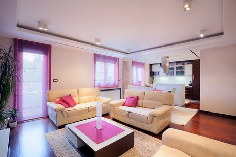
Hot pink and red accents: a win-win for neutral interiors


Purple accents give the interior a flair of mystery

Green accents: create a feeling of freshness and lightness


Yellow accents: in black and white and gray interiors shine like light bulbs or sunlight

Blue accents: not so spectacular, but calm, restrained, elegant


The image used photobank Depositphotos.com
Flat design
It has long been known that even a small amount of bright color can revitalize the environment, giving the general look of interest, attractiveness, and spectacularity. This technique works great for almost any interior, as well as for the landscape, and for the appearance of a person. For example, a bright tie transforms a man with a strict suit, and bright accented scarves and bags - women with neutral clothes. Even a small flower bed is enough to make the whole garden even more beautiful. Adding a small amount of bright accents, we bring some freshness to the interior.
Putting bright accents for the interior is not so easy as it seems at first glance. The main problems arise during the determination of accent color and the choice of its quantity. If, for example, there are too many color accents, then the room will become excessively bright. And the effect of the accent can be completely lost, since the accent color dissolves in the surrounding motley space and goes into an auxiliary one. Conversely, if the emphasis is small, we will not be able to achieve the desired result.

Bright accents in the interior. Color selection
Color accents for the interior are elements that have a color different from the colors of the main surfaces that prevail in the room. For example, furniture, textiles, decor and accessories in a pale blue room - these are the color accents. But the light blue elements for the same room - are in addition to the main color. For violet-beige premises, green accessories will be accents, and lilac, lavender or cream - complement. For beige rooms will be accents, while pale brown ones will complement.
So, the basic rule of color accent is: if you need to add bright accents, then you need to choose a different color, and not a different shade. But which one? The choice will depend on the desired effect.
1. The option "Cold-warm." If you want to emphasize the “sultry” of a room in which warm tones prevail (orange, apricot, yellow, terracotta, red, etc.), the emphasis is better on the cold spectrum. For example, there may be shades of purple,. In addition to that, cool accents emphasize the warmth of the room, they will cool its ardor a little more.
And by analogy: if you like a cool surroundings created using fresh, light, or slightly gloomy tones, then its coolness can be distinguished by contrast with accents of warm colors. To do this, apply the accents of honey, yellow, orange, terracotta shades.
2. Option "Similar." If you need to create an atmosphere of calm, the emphasis should be on the color located on the color wheel next to the secondary or primary.
For example, if the room is executed in blue tones, then the emphasis is better to take pale purple (lavender, lilac) or green. Bright red accents of berry shades refresh the apricot room.
With this option, emphasis in the interior is ruled by harmony and peace. As a result of this, such a scheme is better suited for lounges, bedrooms, offices, etc.
3. Option "Additional". In order to add more energy, life and color to the interior, they use another option - “additional”. For this scheme, color is used for emphasis, which is complementary to the primary or secondary.

Complementary colors are colors that are opposite each other, on the color wheel.
For example, if the room is the main one, then for additional accents you need to choose shades of blue or blue, and vice versa. In the room of green tones, purple or red accents are placed in the same way.
The “Additional” option is quite complicated - it creates a powerful energy supply for the interior. As a result of this, this scheme is recommended to be used only in dining rooms, living rooms, games rooms, etc.
4. Bright accents for a neutral interior. Suppose there are only neutral tones in the room, for example black, white, beige, gray, brown, then you can take any existing color for emphasis. In addition, there may be many such colors.
The neutral interior is good because you can change the emphasis in your mood. Or, say, taking the time of year as a basis. In winter - in blue and blue tones; in autumn - red-orange tones; in summer - green tones; in spring - delicate floral shades.
In neutral interiors of very light colors, you can make several different colors at once, no matter where they are on the color wheel in relation to each other. But it is desirable that these accent colors harmonize with each other in terms of brightness and saturation. For example, light blue can easily get along with pistachio, lilac, pink, but not with dark purple, jade or burgundy.

Bright accent obtained using the sofa. Yellow accents in the interior
Bright accents in the interior. Balance
There is a classic axiom. Or rather, a certain formula. It looks like this: 60-30-10. How to decipher it?
60% is the main color of the interior
30% is the secondary color (optional) or the color shades of the primary in the interior
10% is the accent color of the interior
Such a formula is fully valid for the image of a person in classic clothes. It looks something like this: 60% is a classic suit, 30% is a shirt, 10% is a tie, which is an accent.
Here is an example for the interior. Suppose the walls of the room are painted with beige paint, and the TV stand, shelving and flooring have a wood texture. As a result, brown-beige gamma prevails, amounting to approximately 60%. Let's say that the upholstered furniture and textiles in this room are in purple colors. in this case, it is a secondary color, roughly occupying 30%. The accents may be yellow, green or blue, it all depends on the intended effect. About 10% must remain on them: it can be, for example, a small carpet in front of the sofa, ottoman, several sofa cushions, a chair cover and floor vase.

The following example. Upholstered furniture and wall designs are made in blue and blue tones (60%). Furniture and flooring - gray colors (30%). Accents - orange (10%).
These figures are of course quite arbitrary and approximate. You just need to understand that the main color should have occupied not much more than half. Secondary colors (or adjacent to the primary tone) - almost half the primary. And the accent color is about one tenth of the main color.
Since the color of the tree refers to neutral colors, it may not be taken into account in our formula. That is, you can not accept wooden floors for calculation, but a carpet located on the floor is a must. The same can be done with white ceilings and walls, wooden or white doors and window frames, a stone section of the wall covered with stone, a brick lined fireplace, etc.
If your interior is monochrome and it does not have a secondary color, then the accents will be able to occupy not much more than 10%.
Sometimes, just one bright accent in the interior. But it must be either very spectacular or large. For a monochrome interior, it can be, for example, amazing or. Single accents can make a room’s interior very impressive. Comparisons pop up in my head: an absolutely white snowy forest with one blood-red bush of a mountain ash or a completely black cat with green eyes.
The less accent color - the more it stands out, attracting attention to itself, and everything around it.

Bright accents in the interior. Location
To create a color accent for any interior, various decorative elements are usually used: figurines, vases, photo frames, cushions, rugs, rugs. Although for emphasis can be made and works of art, and pieces of furniture, and surfaces.
With regards to furniture, pouffes and armchairs, sometimes sofas, are more often accented. For the interior of the bedroom, the headboard can be an accent. In the kitchen - some of the facades of the kitchen set and chairs.
The emphasis may be the entire wall or part of it. For example, the area behind the TV, behind the head of the bed or behind the sofa. In the kitchen it is logical to make an accent. You should always remember the 10% rule.
Curtains, like the rest of the textiles, can also be accented: napkins, chair covers, bed covers, tablecloths.
Today, the use of accent lamps, for example, in the kitchen and dining room, is popular.
Of course, not everywhere and not always necessary. Non-vibrant two-tone or monochrome interiors are beautiful in their own right. But you can always, if you wish, intersperse a small amount of color in them, because for this you do not need to spend a large amount of money and radically change the situation. The interior can be transformed and sparkle with new colors!
An important role in creating a cozy and spacious apartment interior is decided by bright accents. With the help of some nuances and details, you can not only visually increase its area, but also convey a unique and original design. This is what will be discussed in this article. We will present you some simple, but at the same time original and interesting solutions.
The main rules when placing accents
Now, we will present to your attention the basic, simple and interesting rules that will help you correctly identify and place bright accents in the interior of the apartment:
- Color balance. Use a color ratio of 6-3-1. 6 - means 60% filling the apartment with the main color, 3 - will be in additional, 1 - that is, 10% in accent.
- Try to use the primary color as neutral. You can also use additional color instead.
- If your apartment will not have a primary color, then add another 10% of the color to the accent color.

Important! Do not focus the apartment on accent colors. This will affect the overall integrity of the interior in a negative way.
- If the primary colors of your apartment have exclusively white or light colors, then you can dilute the monotony of the interior with several accent colors at once. However, do not overdo it, they should be combined in their saturation and overall brightness.
- In some cases, it is sufficient to focus on one or more interior items. For example, on a sofa or a large chandelier.
- The last rule. The less you use the accent color itself, the more it will attract your attention and the attention of your guests.

Determination of the desired color
Complementary scheme of the interior. If you intend to use several accent colors for your apartment, then this tip is for you. First you need to decide on the main accent color, then choose a complementary color for it. In other words, you need to make the eyes pleasing gamut of vibrant colors complementing each other.

If warm and saturated colors are more superior in your room, then it is worth focusing on cool accent colors. This method will not only emphasize the aristocracy of your apartment, but also add a little "chill" and comfort to it.

If your interior is rich in neutral tones such as: white, gray, brown and black, then you can use absolutely any accent colors acceptable to you. This will not affect the color of the apartment as a whole. You can also use some additional colors.

For those who want to draw maximum attention to their home, pay attention to the white interior design living room. Such a room will definitely not leave indifferent any visitor. But it is worth remembering that the white color, like the combination of gray-white or white-beige, does not hide anything, but only emphasizes all the flaws of the builders. Therefore, giving preference to such a radical style, you need to think through everything to the smallest detail and preview the photo of the options for combining white with other shades.
What styles are most suitable for snow-white surfaces?
Making living room in minimalist style, designers often resort to white. Especially if the room is small. White-gray shades make the space more free. Correctly selected furniture will create a harmonious and comfortable atmosphere even in a minimalist interior. In this style, the walls are usually left as empty as possible, but you can decorate them with black and white photos in plain frames. Design from such a solution is not exactly affected.